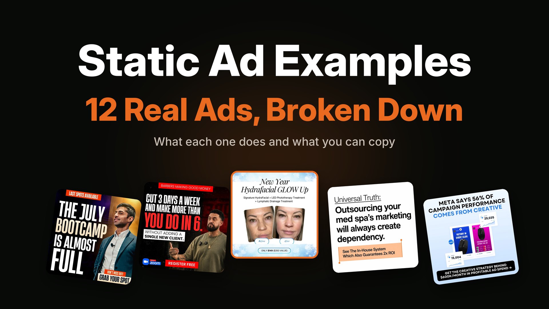
TL;DR: A good static ad does one job: it makes the right person stop, understand the offer in two seconds, and click. Below are 12 real static ads from my own portfolio, grouped by industry, with what each one does well and what you can copy. The patterns repeat: a headline that names the buyer or the pain, one clear picture, one piece of proof, one offer, one button.
Most "static ad examples" pages show you a screenshot and say "this works because it is bold." That does not help you make your own ad. You cannot copy "bold."
So in this post I will do it differently. I will show 12 static ads I designed for paid social, and for each one I will say what the ad is doing, why it fits the buyer, and what you can steal for your own. These are ads for coaches, e-commerce products, beauty clinics, B2B services and events. I have not put performance numbers next to them, because results depend on the offer, the audience and the budget, and I would rather not make claims I cannot prove in a blog post. What I can show you is the thinking behind each layout.
New to the term? Start with what a static ad is. If you want to see more, my full static ads portfolio has every category.
How to read a static ad in five seconds
Before the examples, here is the five-part check I use on every ad, mine or anyone else's. Once you see it, you cannot unsee it.
- The hook. The first line a buyer reads. Does it name a person, a pain or a result?
- The visual anchor. The one thing the eye lands on first. A face, a product, a number, a before and after.
- The proof. Why should I believe this? A stat, a review, a guarantee, a comparison.
- The offer. What do I get, and what does it cost me? Price, free class, free call, bonus.
- The button. What is the next step, and is it small enough to take right now?
A weak ad is usually missing one of these, or it has all five fighting for attention. The best ads give one of them the lead role and let the rest support it. I go deeper on each part in the anatomy of a static ad.
Static ad examples for coaches and webinars
Webinar and coaching ads have a hard job. The product is an idea, not an object, so the ad has to make the buyer feel seen in a few words. Most of my webinar ads lean on three things: a big, bold headline, a real person's face, and one very clear button.
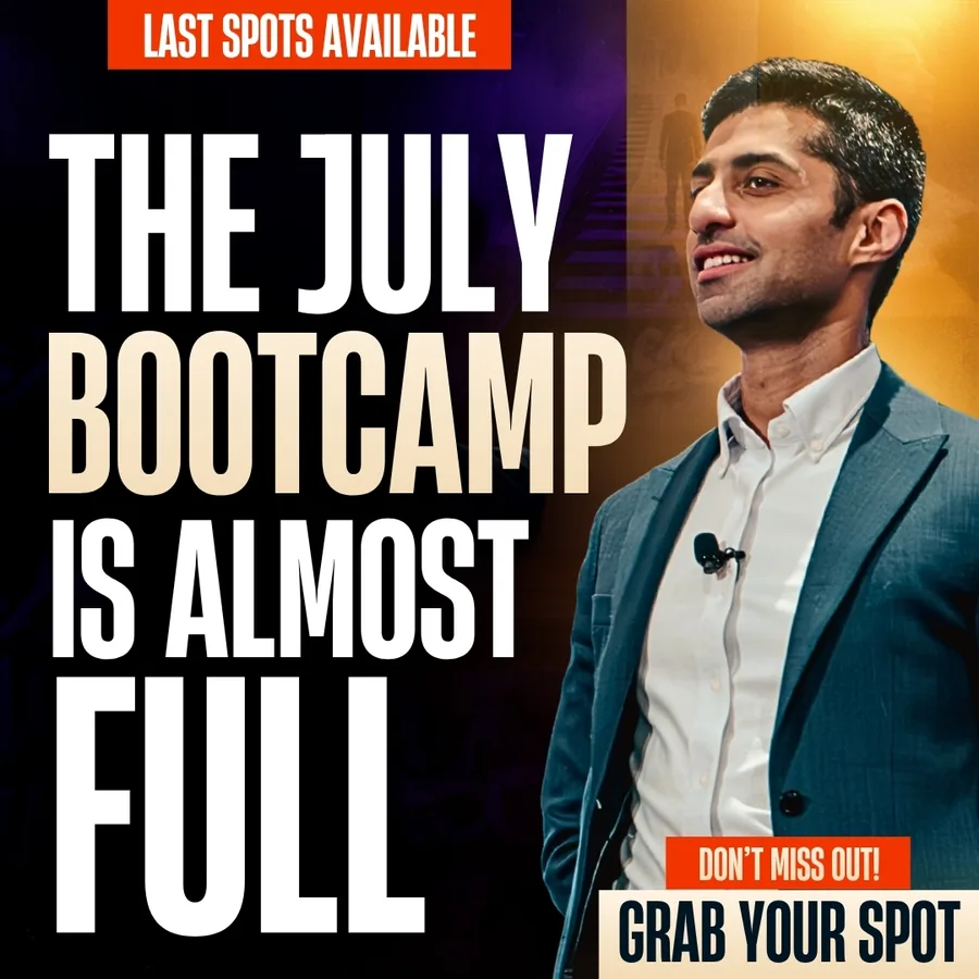
Example 1: The scarcity headline
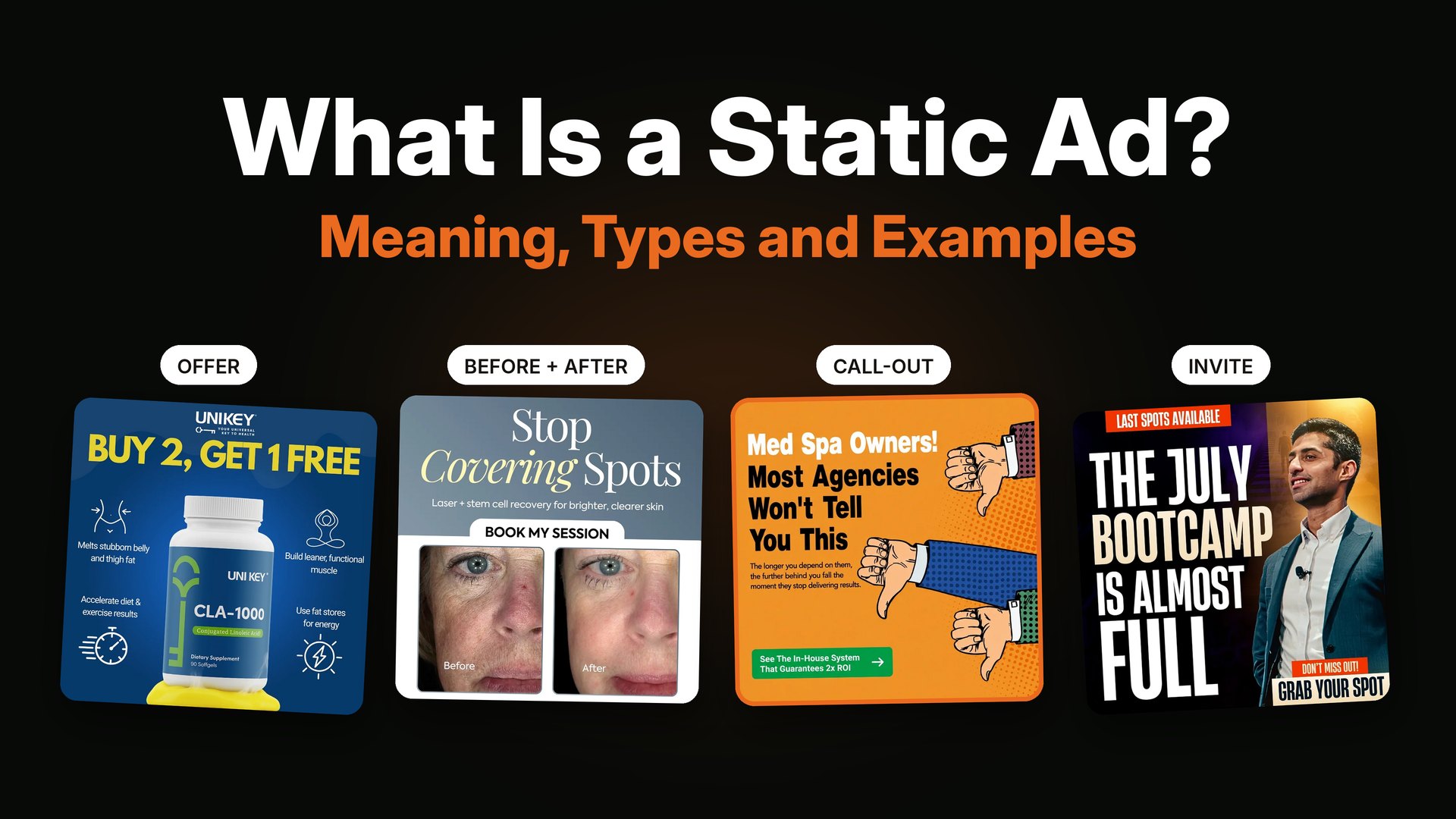
What it does: The headline is the whole ad. "The July bootcamp is almost full" does not explain the event at all. It does something better: it tells you other people already said yes. The speaker's face sits on the right, looking at the viewer, and a small orange tag at the top says "Last spots available." The button is just "Grab your spot."
Why it works for this buyer: Someone scrolling already knows what a bootcamp is. The only question is whether they are late. Scarcity answers it.
Steal this: If your event really has limited seats, put that fact in the headline and not the footer. Never fake it, because a fake countdown ruins trust fast.
Example 2: The result plus the objection
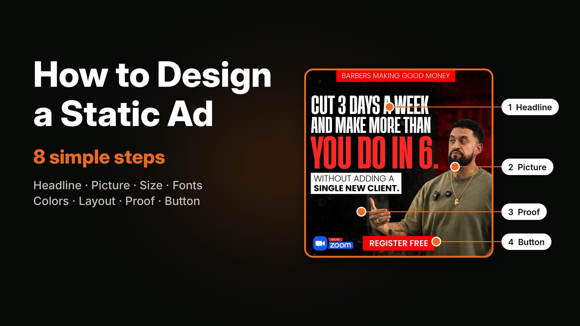
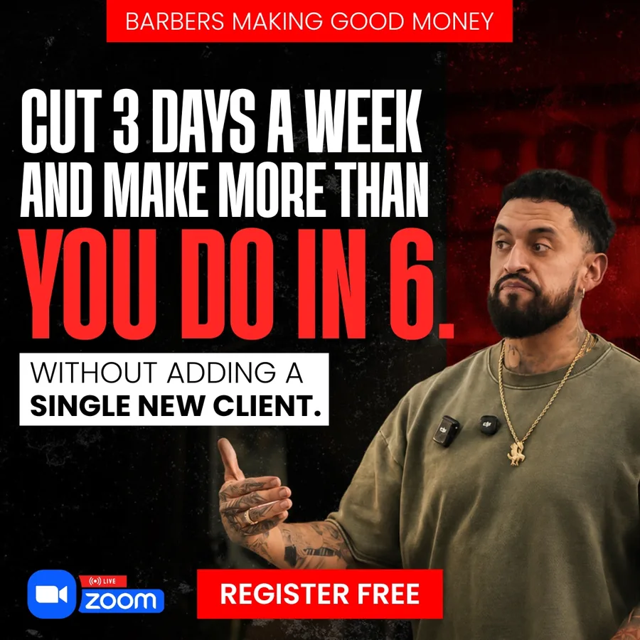
What it does: "Cut 3 days a week and make more than you do in 6." That is a strong result. Then the small white box underneath does the clever part: "Without adding a single new client." A barber reading this immediately thinks, "But how, I need more clients." The ad has already answered the doubt before it formed. The red tag at the top, "Barbers making good money," tells the right people this is for them.
Steal this: Write down the first objection your buyer will think of, and answer it in a small line right under your main promise.
Example 3: The audience tag and the joke that kills fear
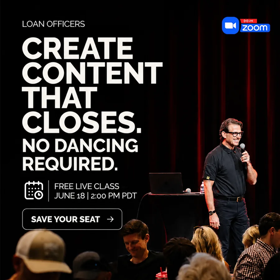
What it does: The ad opens with the audience, "Loan officers," in a small label. Then the headline: "Create content that closes. No dancing required." The second sentence is there for one reason. Many professionals avoid content because they picture themselves dancing on camera. One short line removes the fear. The free live class date sits at the bottom with a quiet "Save your seat" button.
Steal this: Name your buyer at the very top. Then use one short sentence to remove the biggest thing holding them back.
In webinar ads the headline is not the topic. It is the reason to show up.
I wrote a full guide on this niche: webinar ads for coaches covers benchmarks and the checklist I use.
Static ad examples for e-commerce
With a physical product, the picture does half the work. The job of the text is to say what the product does for the person who buys it, and to give them one reason to trust it.
Example 4: The product hero with the benefit built in
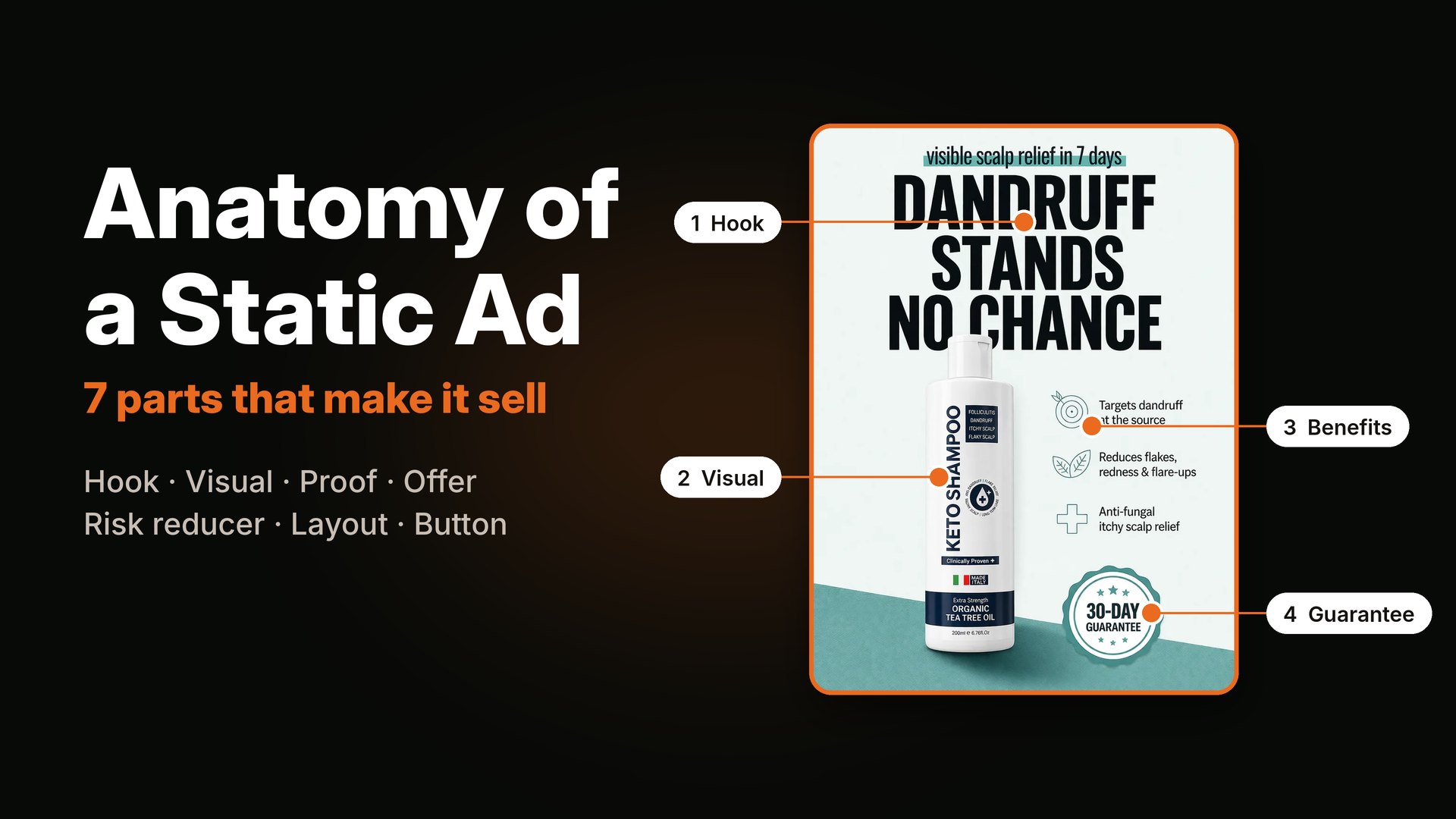
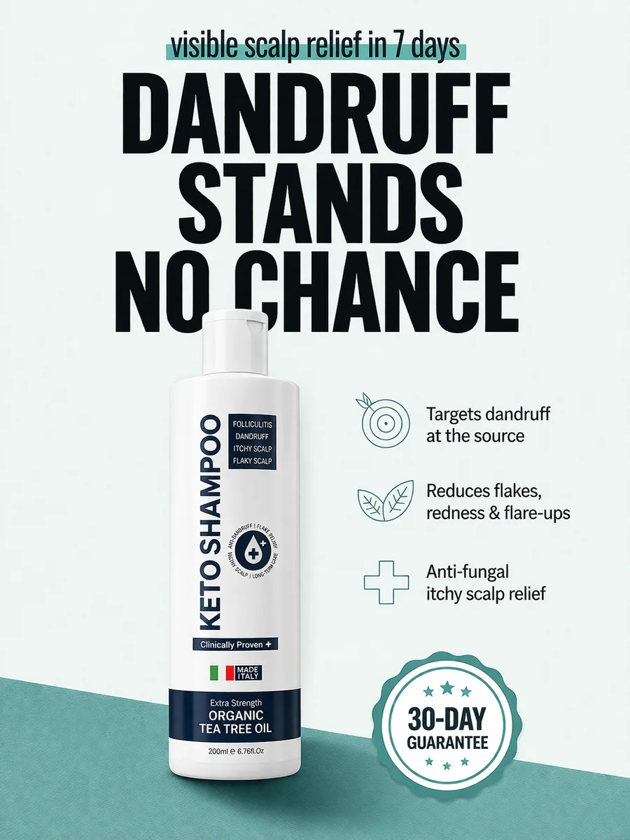
What it does: The product bottle is in the middle and big. The headline is the benefit: "Dandruff stands no chance." Around the bottle, three short icon lines say what it does: targets dandruff at the source, reduces flakes and redness, anti-fungal scalp relief. At the bottom, a round "30 day guarantee" badge lowers the risk. The top line adds a time frame, "visible scalp relief in 7 days."
Steal this: Put the product in the center, the benefit above it, and the risk reducer (guarantee, free returns) in a badge. A buyer should understand the product without reading a paragraph.
Example 5: The comparison table
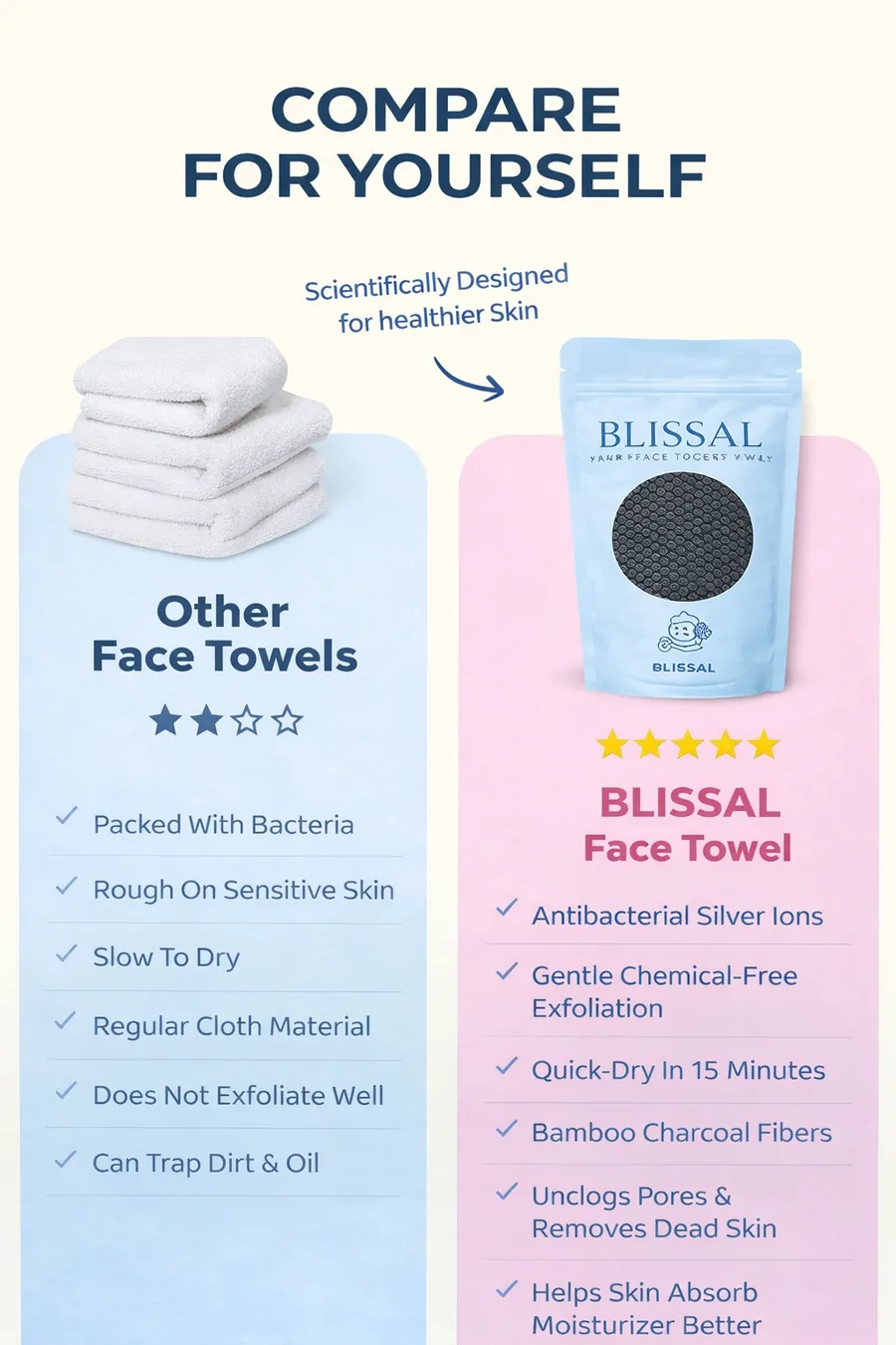
What it does: "Compare for yourself" sets two face towels side by side. The other towel gets a low star rating and a list of small problems. Ours gets full stars and a list of small wins. The reader does the thinking, and that feels more honest than being told "we are better."
Steal this: If you have a clear edge over the usual option, show it in a two-column table. Keep each row short, and keep the language fair. Buyers can tell when a comparison is rigged.
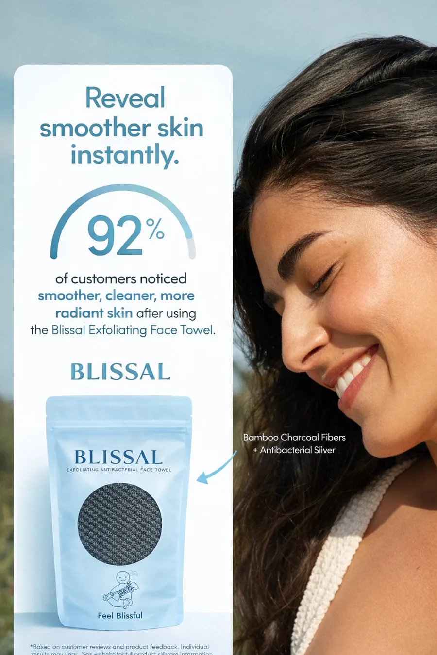
Example 6: The number plus a happy face
What it does: A large "92%" with a short line, "of customers noticed smoother, clearer, more radiant skin," sits beside a smiling model. The number gives proof, and the face gives the feeling. It also uses the word "instantly" in the headline to promise speed.
Steal this: One real number beats three adjectives. If you have survey results or review data, make the number the visual anchor. Always keep the source on hand, because ad platforms and buyers both ask.
Want more on this niche? See my e-commerce static ads and decide which style fits your product.
Static ad examples for beauty clinics and local offers
Clinics and local services sell trust and a clear offer. The best ads here show a real result, a price that feels like a deal, and one easy next step.
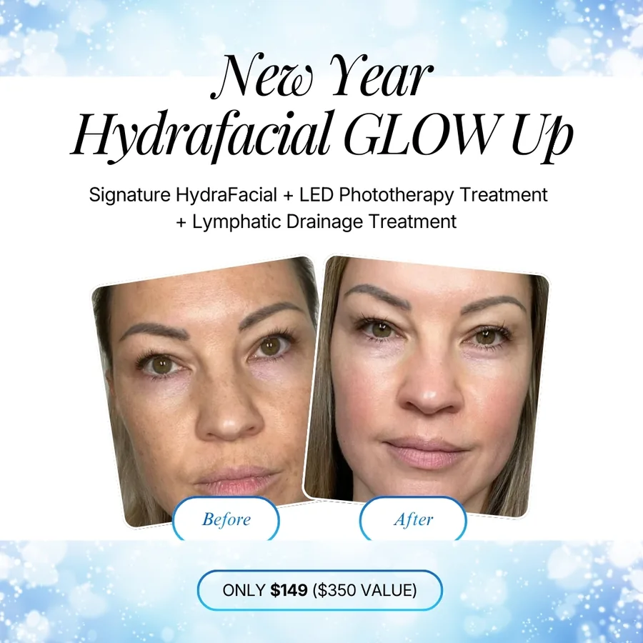
Example 7: Before and after with a price anchor
What it does: Two close-up faces, labeled "Before" and "After," fill the middle. Above them, the offer lists what is inside the package. Below, the price: "Only $149" with "$350 value" next to it. The seasonal headline, "New Year Hydrafacial Glow Up," gives people a reason to act now.
Steal this: Show the offer as a stack: treatment one plus treatment two plus treatment three, then the real value and the low price. People understand a deal faster when they see what it is worth.
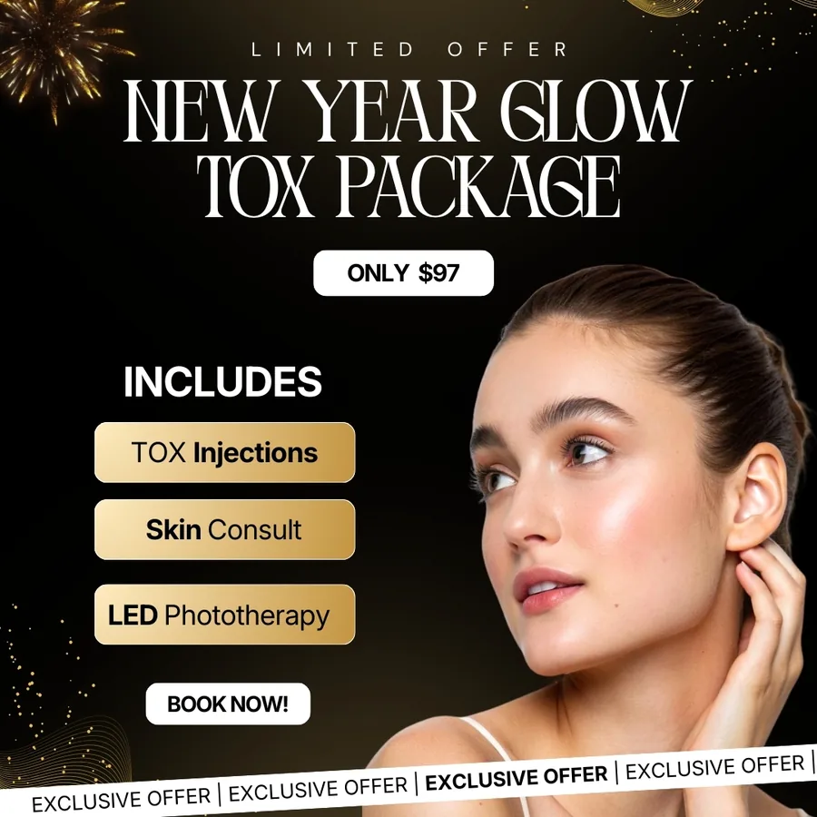
Example 8: The "includes" list
What it does: A single model portrait, big and clean, on a dark background. Next to her are three gold boxes: injections, skin consult, LED phototherapy. The price, "Only $97," is in a bold outlined label, and the button says "Book now."
Steal this: A short "includes" list turns a vague package into something concrete. Three items is enough. More than five and nobody reads it.
If you run a clinic, you will also like what I wrote about hiring a static ad designer, which covers what to ask for in a brief.
Static ad examples for B2B, services and SaaS
B2B ads often skip the pretty picture and win with a sharp message. The audience is smart, busy and a little tired of marketing, so honesty and clarity work better than hype.
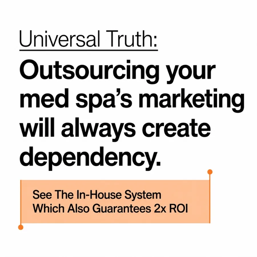
Example 9: The plain text ad
What it does: No photo at all. A white background, a small underlined line, "Universal truth," then a strong claim in large type: "Outsourcing your med spa's marketing will always create dependency." One orange note at the bottom holds the offer. It looks like a note someone typed, not a polished ad.
Why it works for this buyer: Owners see so many designed ads that a plain one stands out. It also feels like an opinion from a person and not a brand.
Steal this: If your market is flooded with glossy creative, test one text-only ad. It costs almost nothing to make, and it often tells you which message is strongest.
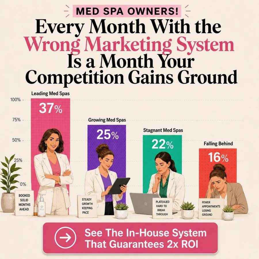
Example 10: The chart that makes the claim real
What it does: A bar chart with four bars shows leading businesses growing and others falling behind. A headline above it says every month with the wrong system gives the competition more ground. The chart is simple enough to understand in one look, and it turns an abstract warning into a picture.
Steal this: If your message is about a gap or a cost of waiting, draw it. Even a rough bar chart works better than a paragraph. Keep any chart honest and based on numbers you can back up.
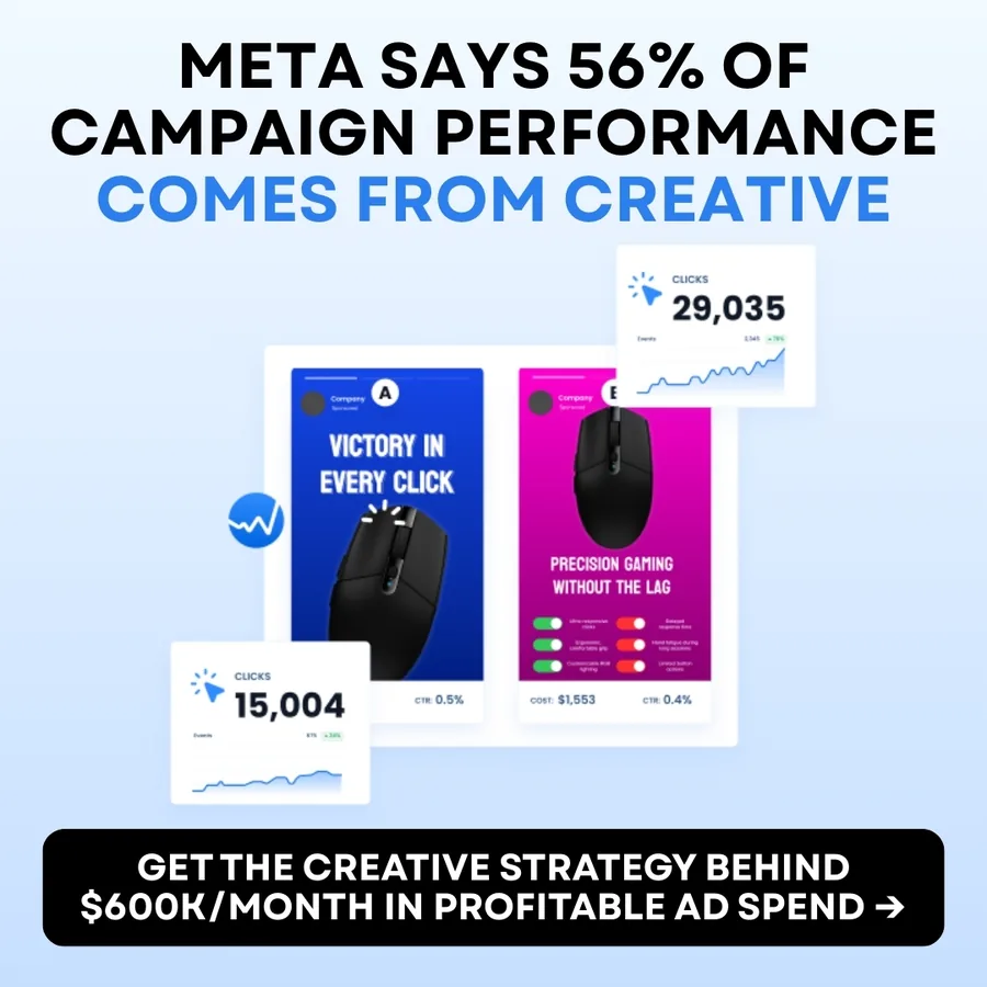
Example 11: The borrowed authority hook
What it does: The headline opens with a source people already trust, "Meta says," and then gives one strong fact. Below it, a clean product-style visual with real-looking numbers shows the idea in action. The button is the only dark element on the ad, so it is impossible to miss.
Steal this: If a respected third party has said something that supports your offer, lead with it. Always link or cite the original, and do not stretch it beyond what it says.

Example 12: The picture that says the problem
What it does: A pile of money on fire. The headline: "Making great money, no idea where it goes." One photo and one sentence tell the whole story, and the button, "Book a free call," asks for very little. It is a good example of a picture doing the explaining so the text can stay short.
Steal this: Find the one image that shows your buyer's problem without a caption. Then make the headline match it.
What all 12 ads have in common
I made a quick table of the patterns. It is the same checklist from the start of the post.
| Ad | Hook | Visual anchor | Proof or risk reducer | Button |
|---|---|---|---|---|
| 1. July bootcamp | "Almost full" | Speaker face | Scarcity | Grab your spot |
| 2. Barbers | Cut 3 days, earn more | Face and big type | Objection answered | Register free |
| 3. Loan officers | Content that closes | Speaker photo | Fear removed | Save your seat |
| 4. Keto shampoo | "Dandruff stands no chance" | Product bottle | 30 day guarantee | Shop |
| 5. Face towels | "Compare for yourself" | Two-column table | Side by side facts | Shop |
| 6. 92% stat | Smoother skin | Number and face | Customer survey | Shop |
| 7. Hydrafacial | Glow up package | Before and after | Value vs price | Book |
| 8. Glow tox | Package for $97 | Model portrait | Includes list | Book now |
| 9. Plain text | "Universal truth" | Large text | Guarantee line | Learn more |
| 10. Bar chart | Wrong system costs ground | Chart | Visual gap | See the system |
| 11. Meta stat | "Meta says" | Product visual | Trusted source | Access the system |
| 12. Burning money | "No idea where it goes" | Money on fire | Free call | Book a call |
The big lesson is that there is no single magic layout. Dark, light, photo, text only, chart or table: every one works when the five parts are clear and the message fits the buyer.
How to use these examples for your own ads
Do not copy a layout. Copy the thinking. Here is a simple way to do it.
- Pick your buyer first. Write one sentence: "This ad is for [person] who is struggling with [problem]."
- Choose the lead part. Is your strongest asset a result, a number, a face, a comparison or a price? Make that the star.
- Write three headlines before you design anything. Test the clearest one.
- Build one ad in two or three styles. For example, one with a photo, one text only, one with a chart. Same message, different look.
- Launch, then learn. The goal of a batch is not to find the prettiest ad. It is to find the angle that sells. If you are not sure how many to run, read how many ad creatives to test per week.
And keep in mind that even a winner wears out. When results drop after a few days or weeks, it is usually creative fatigue, not a broken account.
Common mistakes I see in static ads
- Too many messages. Three benefits, two offers and a discount all fighting for space. Pick one.
- Text that is too small. Most people see your ad on a phone while walking or half-watching TV. If you cannot read it at arm's length, it is too small.
- No clear button. Even a soft "Learn more" is better than no next step.
- A pretty picture with no point. Good looks help a bit, but the message does the selling.
- Copying a competitor's ad. If everyone in your market uses the same look, the ad that looks different is the one that gets noticed.
FAQ
What makes a good static ad?
A good static ad has one clear message, one visual anchor, one piece of proof and one button. The buyer should understand who it is for and what they get within two seconds of seeing it.
How many words should a static ad have?
As few as possible. A headline of about 5 to 10 words and a short support line is usually enough. Long paragraphs belong on the landing page, not in the image.
Are static ads still worth running in 2026?
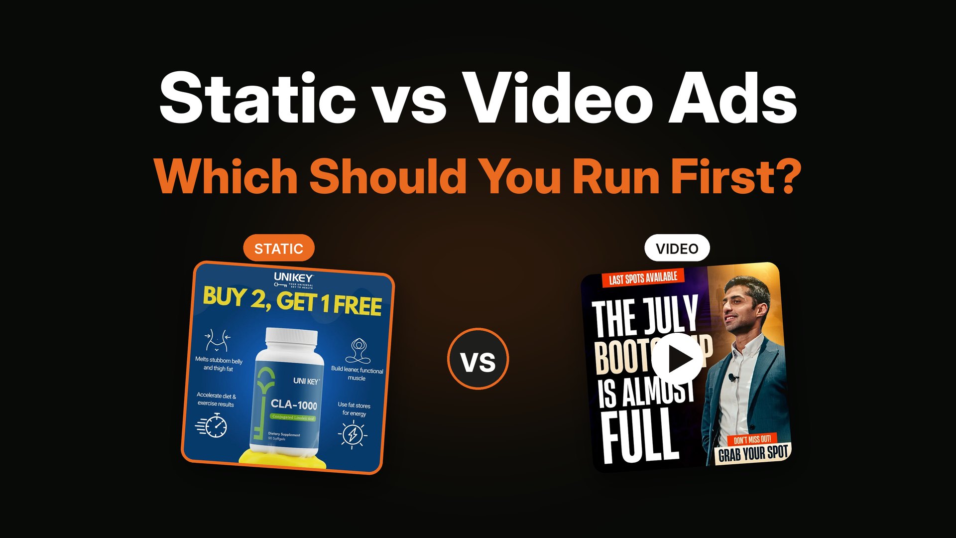
Yes. They are fast to make, cheap to test and easy to rotate. Many accounts run a mix of static and video, and I explain how to split the two in static vs video ads.
What size should a static ad be for Meta?
The most common sizes are square (1:1) and vertical (4:5) for the feed, and 9:16 for stories and reels. Make the key message sit in the center so it survives different crops.
Can I use these examples for my own ads?
Use them as inspiration for structure and thinking, not as templates to copy. The ads above were designed for specific clients, offers and audiences. Your ad should use your own offer, words and brand.
Do I need a designer to make good static ads?
Not always. Many founders start with simple tools. A designer helps most when you need a steady flow of new angles every week, and when you want someone who thinks about the message and not only the layout.
How do I know which static ad will win?
You do not, which is exactly why you test. Launch a small batch with different angles, give each enough budget to learn something, and keep the one that gets sales at a good cost.
Want ads like these for your brand?
I design static ads and YouTube thumbnails for DTC, e-commerce, info-product and coaching brands, and I do the strategy too, so you get angles and not only layouts. You can see what is included on my services page. If it looks like a fit, book a short call and we can start with a small test batch.