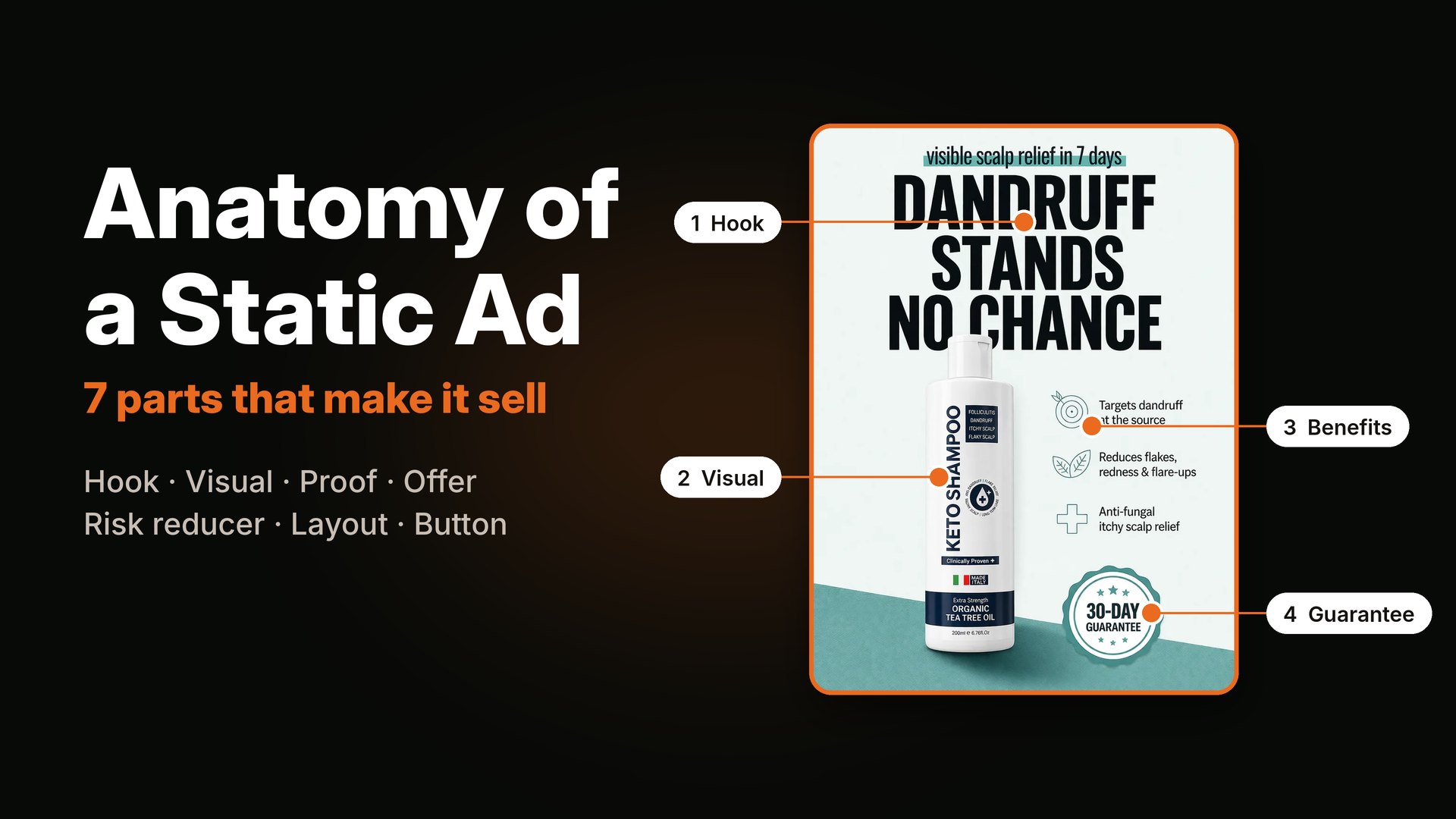
TL;DR: A static ad that sells has seven parts: a hook, a visual anchor, proof, an offer, a risk reducer, a clear layout and one button. Most weak ads are not "ugly." They are missing one of these parts, or they ask the buyer to read five messages at once. Below I take the seven parts one by one, with real ads from my portfolio, and then show a quick way to fix a weak ad in ten minutes.
When an ad does not work, the first thing people blame is the design. "The colors are wrong." "The font is boring." "Maybe we need a different photo."
Sometimes that is true. But in most ads I review, the problem is not the design. It is the structure. The ad does not know what it is trying to say, or it says too much, or it forgets to give the buyer a reason to believe it or a next step to take.
Think of a static ad like a short sales conversation that has to happen in about two seconds, on a phone, while someone is scrolling. It has no time for a story. Every part has a job. If a part is missing, the conversation breaks.
I have designed a lot of static ads for e-commerce, coaching, clinic and B2B brands, and the same seven parts show up every time. I also built a small interactive section on my site that points at these parts on real ads. You can see it in the ad anatomy section. Here, I will go into more detail.
The seven parts at a glance
| Part | The question it answers | Typical form |
|---|---|---|
| 1. Hook | Is this for me? | A big headline that names a person, pain or result |
| 2. Visual anchor | Where do I look first? | A face, a product, a number, a chart, a before and after |
| 3. Proof | Why should I believe it? | A stat, a review, an expert line, a comparison |
| 4. Offer | What do I get, and what does it cost? | Price, bundle, free class, free call |
| 5. Risk reducer | What if it does not work? | Guarantee, free returns, "no dancing required" |
| 6. Layout | Can I take it in at a glance? | One clear path for the eye, big text, space |
| 7. Button | What do I do next? | A short, specific action |
Other people have broken this down too. For example, Segwise lists five parts: scroll-stopping visuals, short copy, a clear call to action, a mobile-first layout, and one clear message. The pieces overlap with mine. The common thread is clarity: one message, one value, one action.
1. The hook: tell the right person this is for them
The hook is the first thing a person reads. It has one job: make the right buyer stop. Not everyone, just the right one.
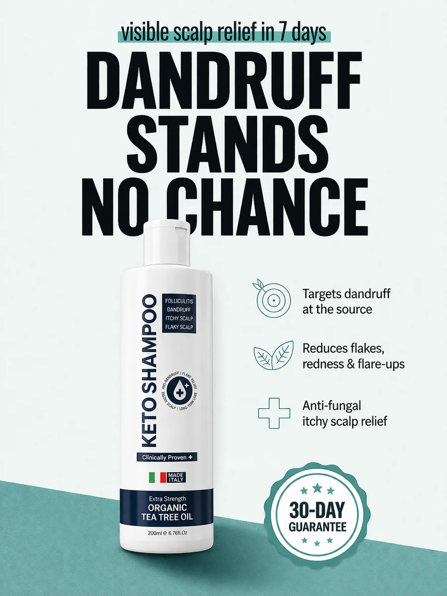
A hook usually does one of these four things:
- Names the person. "Barbers," "Loan officers," "Med spa owners." Putting the audience in the first words is a quiet way to say "this is for you."
- Names the pain. "Behind on your books?" "Dandruff stands no chance." The reader feels it before they think about it.
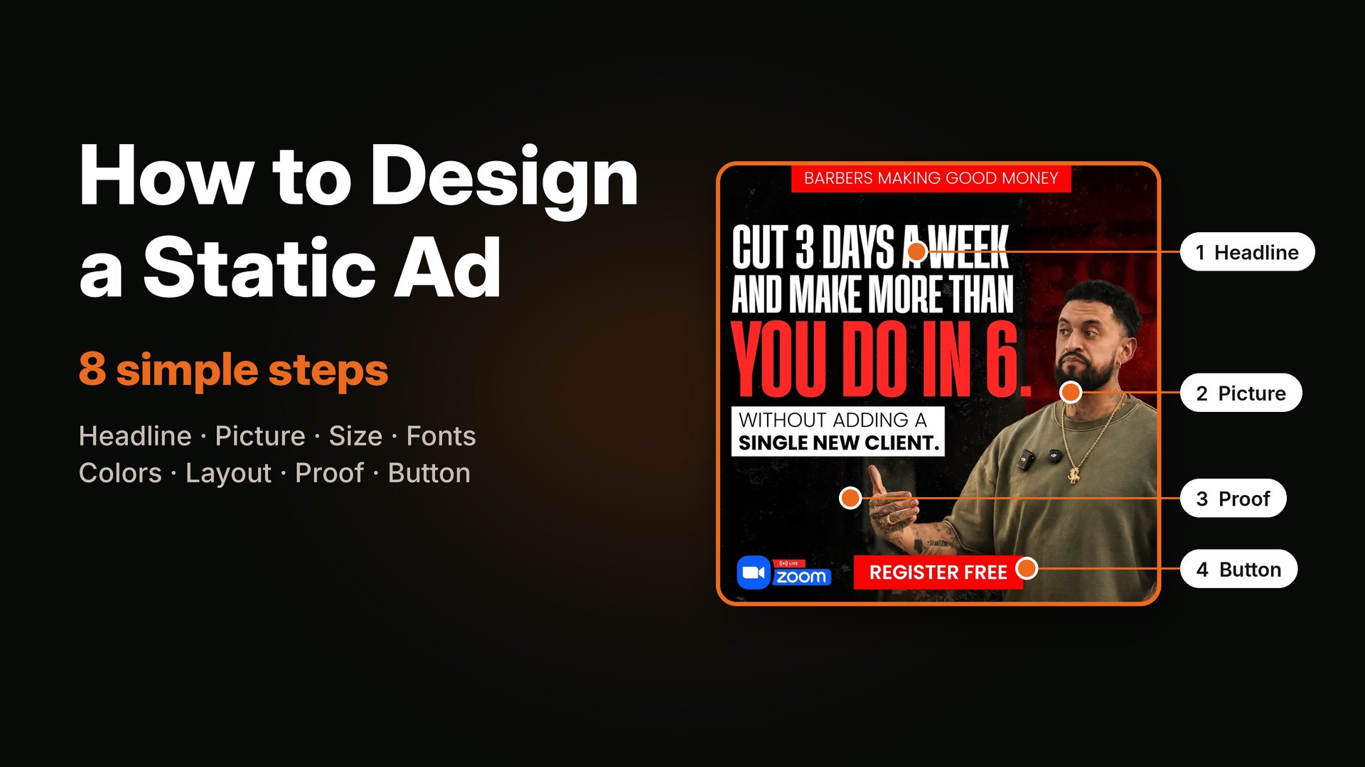
- Names the result. "Cut 3 days a week and make more than you do in 6."
- Names a surprise. "The donuts were never the way in." You are not sure what it means, so you stop and read.
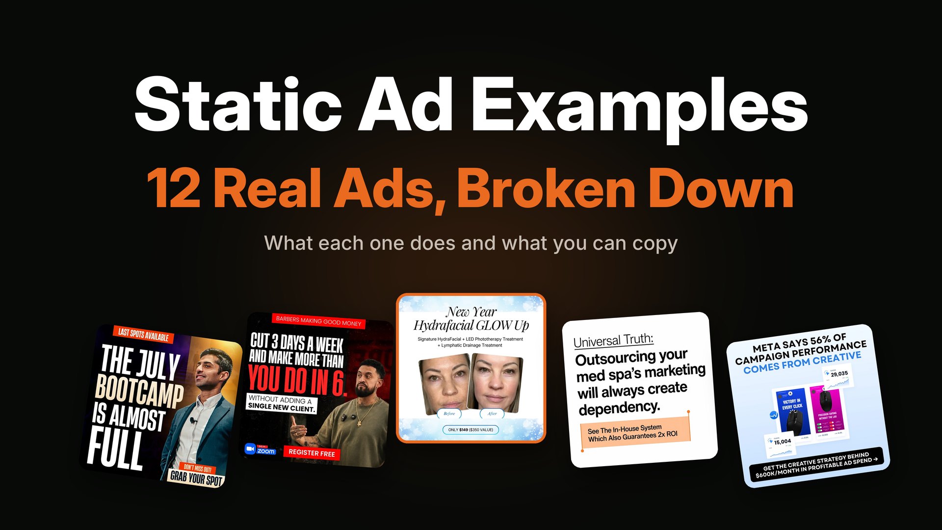
Here are two more hooks from my work, side by side. One is a pain-based question, and the other uses a surprise.

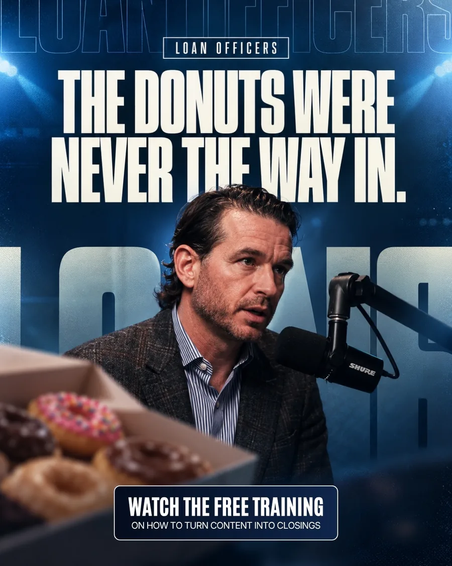
Left: a pain question with "join the club" to remove shame. Right: a curious line that makes the right person want to know more.
A simple test: cover everything except the headline. Could a stranger tell who the ad is for? If not, the hook is too vague.
I wrote more on how the first line affects results in why high CTR does not always mean sales, because a hook that attracts the wrong person gives you clicks and no buyers.
2. The visual anchor: give the eye one place to land
The visual anchor is the thing your eye goes to first. There should be only one. When an ad has three big things, the viewer does not look at any of them.
Common anchors:
- A product. Best for e-commerce. Make it big and clear.
- A face. Good for coaches, experts and events. A face looking at the viewer is hard to scroll past.
- A number. "$50K a week" or "92%" can be the whole picture.
- A chart or diagram. Good when the message is about a gap or a cost.
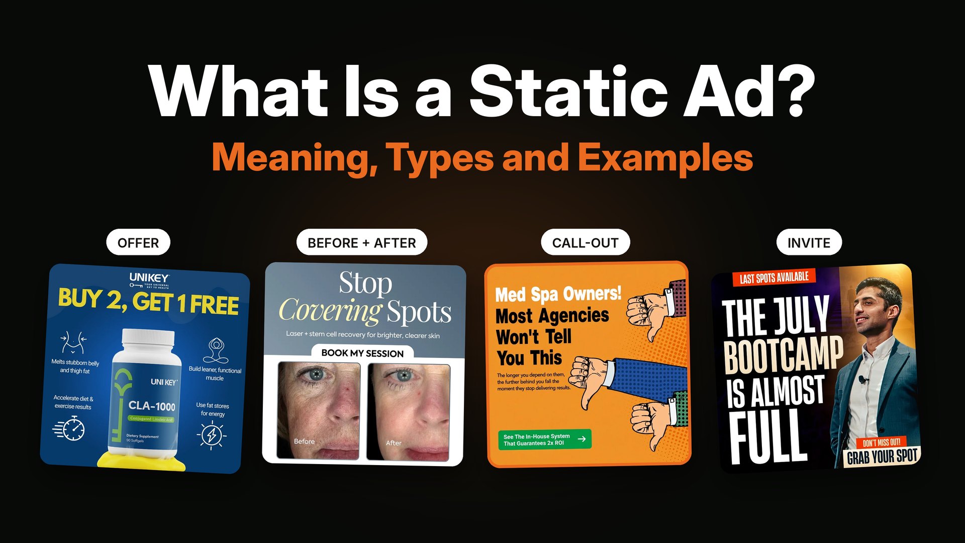
- Before and after. Strong for clinics, fitness and skin care.


Left: the big gold number draws the eye first. Right: a simple bar chart turns a warning into a picture.
A simple test: squint at your ad until the text blurs. What do you still see? That is your anchor. If you see nothing, or you see mud, the ad has no clear focus.
3. Proof: give a reason to believe
A promise without proof is just a claim. Most buyers have seen a lot of claims. Proof is what makes your ad feel different.
Types of proof that fit inside a static ad:
- A number from real data, such as a customer survey or a result.
- A short testimonial, with a name and a real quote.
- An expert line, such as "a men's health expert since 1984."
- A trusted source, such as "Meta says..." (always link to the original in your notes, and do not stretch it).
- A comparison, side by side, with fair language.
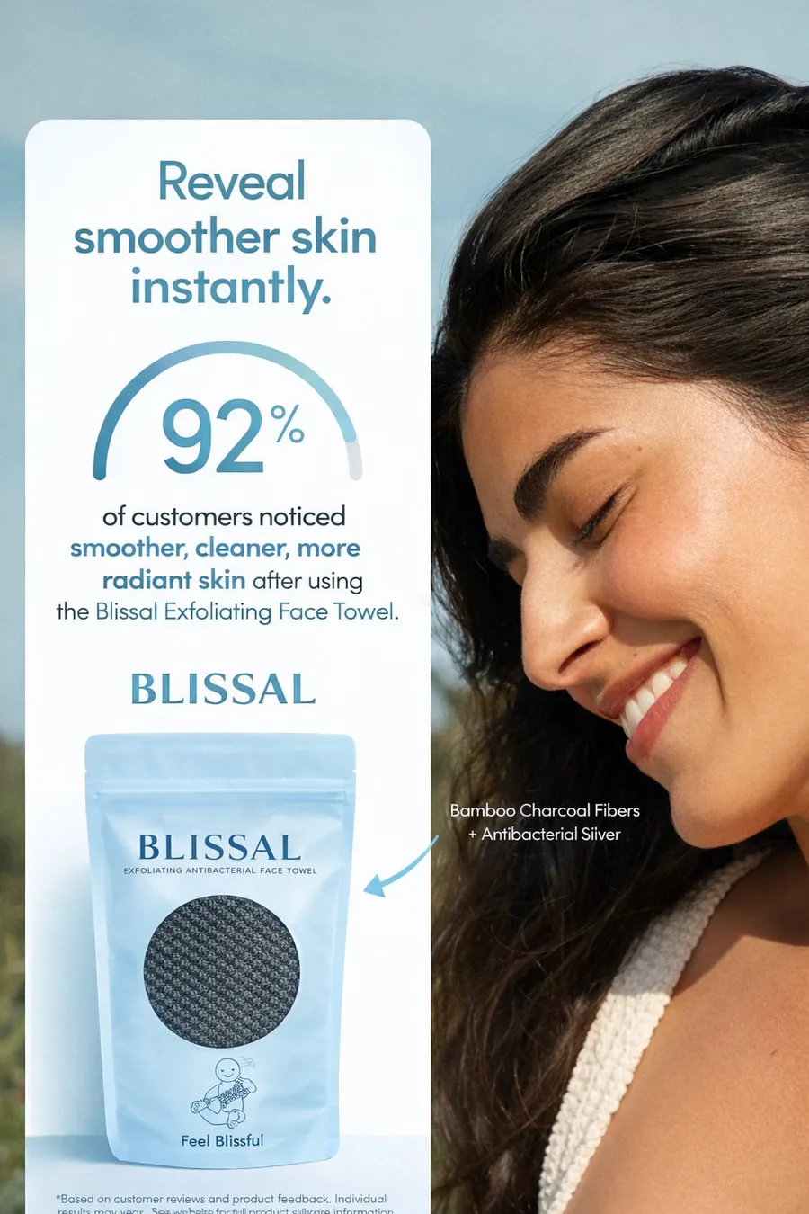
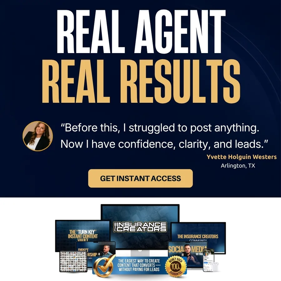
Left: one number does the work of a paragraph. Right: a short quote in the client's own words feels more honest than any slogan.
A word of caution. Only use proof you can back up. Ad platforms review claims, and buyers notice when something sounds too perfect. I would rather use a smaller true number than a big one I cannot source.
4. The offer: say what they get and what it costs
Many static ads sell a feeling and forget the offer. The buyer likes the ad but does not know what to do. A clear offer makes the next step obvious.
There are a few shapes an offer can take:
- A price anchor. "$149" next to "$350 value."
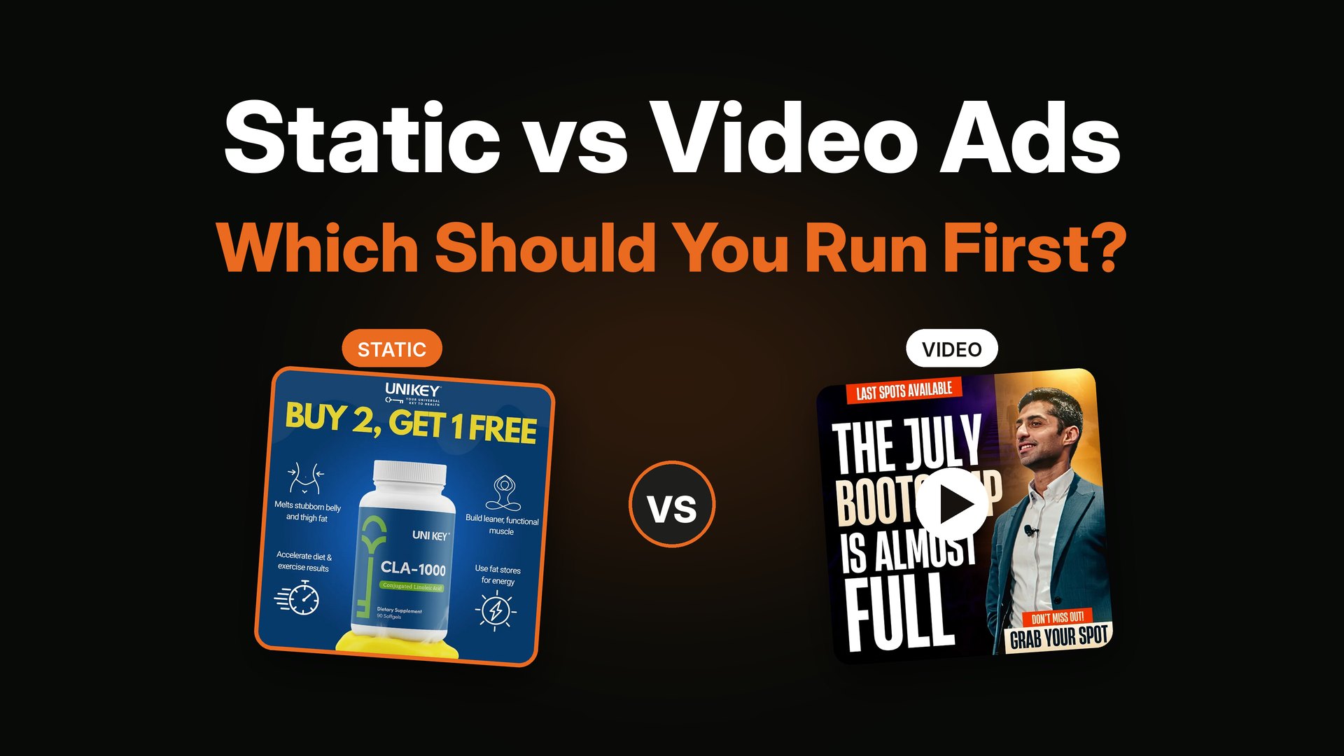
- A bundle. "Buy 2, get 1 free."
- A low-cost entry. "$7.99 for the first course."
- A free thing. A free class, a free call, a free audit.
- A list of what is included. Three items, not ten.
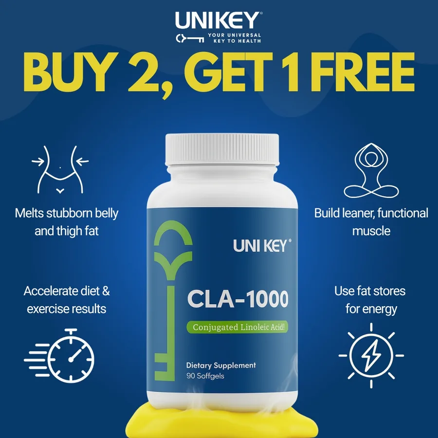

Left: the offer is the hook, in big yellow on deep blue. Right: a short "includes" list and a clear price.
If you are not sure which offer to test first, run two ads with the same design and different offers. It is one of the fastest ways to learn what your buyers value. I explain how to plan a small test in how many ad creatives to test per week.
5. The risk reducer: remove the last doubt
Right before someone clicks, there is often a small voice that says "but what if?" A risk reducer answers that voice.
Examples:
- A guarantee badge: "30 day guarantee."
- Free shipping or free returns.
- A fear remover: "No dancing required."
- A free first step: "Watch the free training."
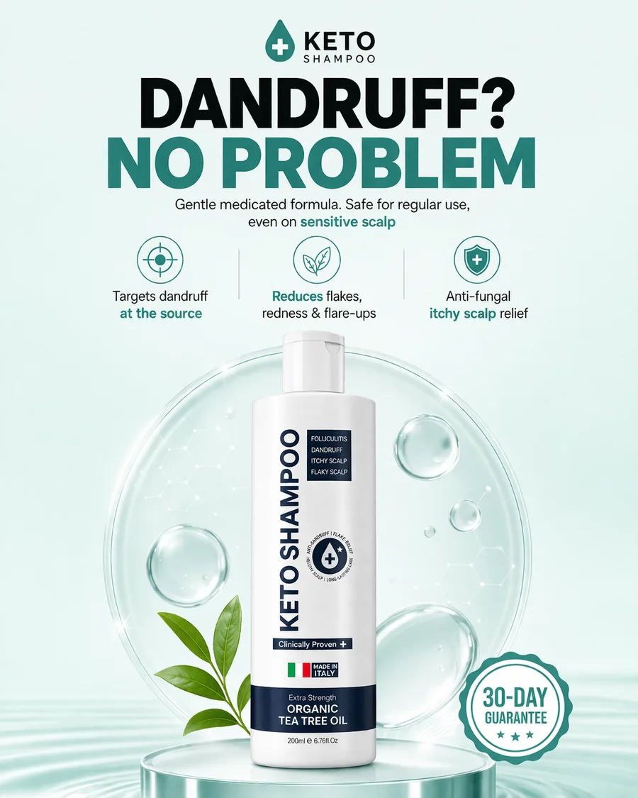

Left: a round guarantee badge sits where the eye ends. Right: one short line removes the biggest reason to avoid content.
The risk reducer is usually small, and that is fine. It is not there to be the star. It is there to be found at the exact moment the buyer needs it.
6. The layout: make it easy to read in one pass
Layout decides whether the other six parts get seen. Good layout is mostly about saying no: no extra text, no extra icons, no crowded corners.
Some rules I use all the time:
- One path for the eye. Usually top to bottom: hook, anchor, proof, button.
- Big text. If you cannot read it on a phone at arm's length, it is too small.
- Contrast. Light text on dark or dark on light. Avoid mid-gray on mid-gray.
- Space. Empty space is not wasted. It tells the eye where to rest.
- Safe zones. Keep key text away from the edges, since feeds and stories crop differently.
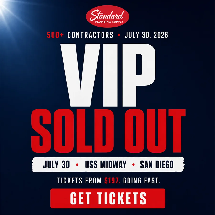

Both ads use very large type, one face or one idea, and one button. You can understand them from across a room.
One way to check your layout: shrink the ad to the size of a stamp. Can you still tell what it says and what it wants? If yes, it will survive a busy feed.
7. The button: one next step, as small as possible
The button is the last part, and it is often rushed. A good button has three qualities. It is specific ("Save my seat" is better than "Click here"). It is small (a free class is a smaller ask than a paid program). And it is clear (the person knows what happens next).


Different buttons for different asks: "Grab your spot" for a limited event, "Click below to fix yours" for a free call.
A few examples that work well:
- "Reserve my free seat"
- "See the marketing system"
- "Book a free call"
- "Shop now"
- "Watch the free training"
Match the button to the stage of the buyer. A cold audience will click on a free thing much more easily than a "Buy now."
Fix a weak ad in ten minutes
Here is a quick exercise you can do with any ad you already have. I will use a made-up example so you can see the process.
The weak ad: a photo of a coaching program laptop mockup, the headline "Transform your business," small text about "proven strategies," and a button that says "Learn more."
Step 1. Find the hook. "Transform your business" could be about anyone. Rewrite it for one person: "Coaches: fill your next group program without cold DMs."
Step 2. Pick the anchor. The laptop mockup does not say anything. Replace it with one number or one face. For example, "Group program full in 21 days" as a big line, if you have a real result like that.
Step 3. Add proof. One short quote from a client, with a name.
Step 4. Make the offer clear. "Free 45 minute workshop. Thursday 7 PM."
Step 5. Add a risk reducer. "No pitch. Just the system."
Step 6. Clean the layout. Remove everything that is not one of the five parts above. Make the hook larger.
Step 7. Fix the button. "Save my free seat."
You may need to rewrite it three or four times. That is normal. The first version is rarely the best, which is why running a few angles is better than polishing one idea for a week.
Common mistakes
- Starting with the design. Write the message first. Then choose the look.
- Too many hooks. If the ad has three headlines, it has none.
- Proof that cannot be checked. Use numbers and quotes you can support.
- Hiding the button. Make it a strong, high-contrast element.
- Treating one ad as the answer. Even good ads wear out. When results fall, see why Facebook ads stop working after a few days.
FAQ
What are the parts of a static ad?
The main parts are a hook (headline), a visual anchor, proof, an offer, a risk reducer, a clear layout and a button. You do not need every part to be big, but every part should be easy to find.
How many words should a static ad have?
Usually a headline of about 5 to 10 words and one short supporting line. If the ad needs a paragraph, the message is probably not clear enough yet.
Should the headline or the image come first?
Write the headline first. Then choose the image that supports it. A beautiful image with a weak message rarely sells.
What makes a static ad convert?
Clarity, relevance and a believable offer. The buyer should know within two seconds who the ad is for, what they get and what to do next.
How do I know which part of my ad is weak?
Look at your numbers. If people do not stop, the hook or the visual is weak. If they click but do not buy, the offer, the proof or the match between the ad and the landing page is the problem. I cover this in high CTR but no sales.
Do I need a designer, or can I make these myself?
You can start yourself with simple tools. A designer helps most when you need a steady flow of new angles and want someone who thinks about the message and not just the layout. You can read what to look for in how to hire a static ad designer.
How long does it take to make a good static ad?
A clear idea can take 30 minutes to a few hours. Most of the time goes into choosing the angle and writing the headline, not into the layout.
Every high converting static ad I make follows these seven parts. Ready to put them to work? Follow the steps in how to design a static ad, or start with the basics in what a static ad is.
Want ads built on this structure?
I design static ads and YouTube thumbnails for DTC, e-commerce, info-product and coaching brands, and I do the strategy too, so you get angles and not only layouts. You can see what is included on my services page. If it looks like a fit, book a short call and we can start with a small test batch.