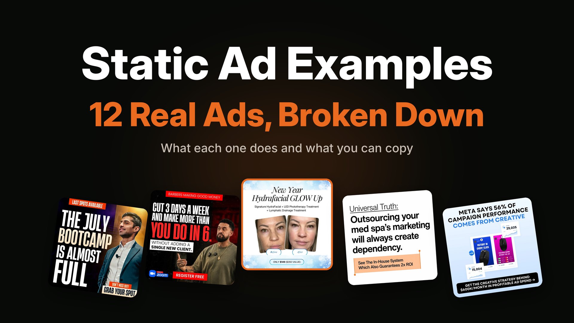
TL;DR: A static ad is an ad made from one still picture. It does not move like a video. It has a short headline, one image, and a button. You see static ads all day on Facebook, Instagram, Pinterest and Google. They are quick to make and easy to test, so most brands start with them.
A static ad is an ad that does not move. It is one image with a short message on it, and it asks you to do one thing. That is all it is.
You may also hear people say "static advertisement," "static image ad" or just "static ads." They all mean the same thing. In this guide I will show you what static ads are, the eight types I make most, where they run, and when to use them. I design static ads for a living, so every example below comes from my own work.
What is a static ad?
A static ad is a still image used as an ad. It does not play like a video. It does not slide like a carousel. You look at it, you read it in a few seconds, and then you click or scroll on.
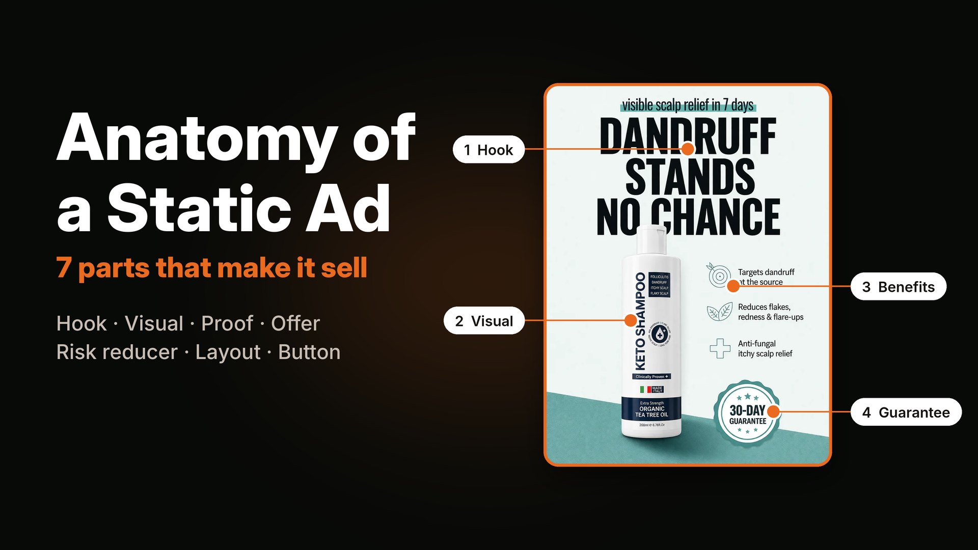
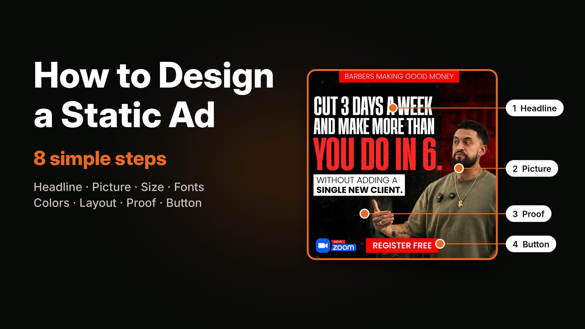
Most static ads have the same four parts:
- A headline that says who the ad is for or what you get.
- A picture of the product, a person or a simple graphic.
- A proof or an offer, like a review, a number or a discount.
- A button that tells you what to do next.
I explain each part in the anatomy of a static ad.
Static ad meaning in simple words
"Static" means "does not move." So a static ad is an ad that stays still.
A video ad moves. A GIF ad loops. A static ad just sits there. It has one frame, one chance, and about two seconds to make someone stop. That is why the design matters so much. There is no second scene to save a weak first one.
Static ads vs other kinds of ads
People often mix these up, so here is a simple map.
| Ad type | What it is | Good for | Weak spot |
|---|---|---|---|
| Static | One still image | Fast tests and clear offers | No motion to catch the eye |
| Video | A moving clip | Showing how something works | Slower and costlier to make |
| Carousel | Several images you swipe | Showing many products or steps | Many people never swipe |
| Animated or GIF | A short looping image | Adding a little motion | Can look cheap if done badly |
| Dynamic | Ads the platform builds from a product list | Selling a big catalog | You control less of the look |
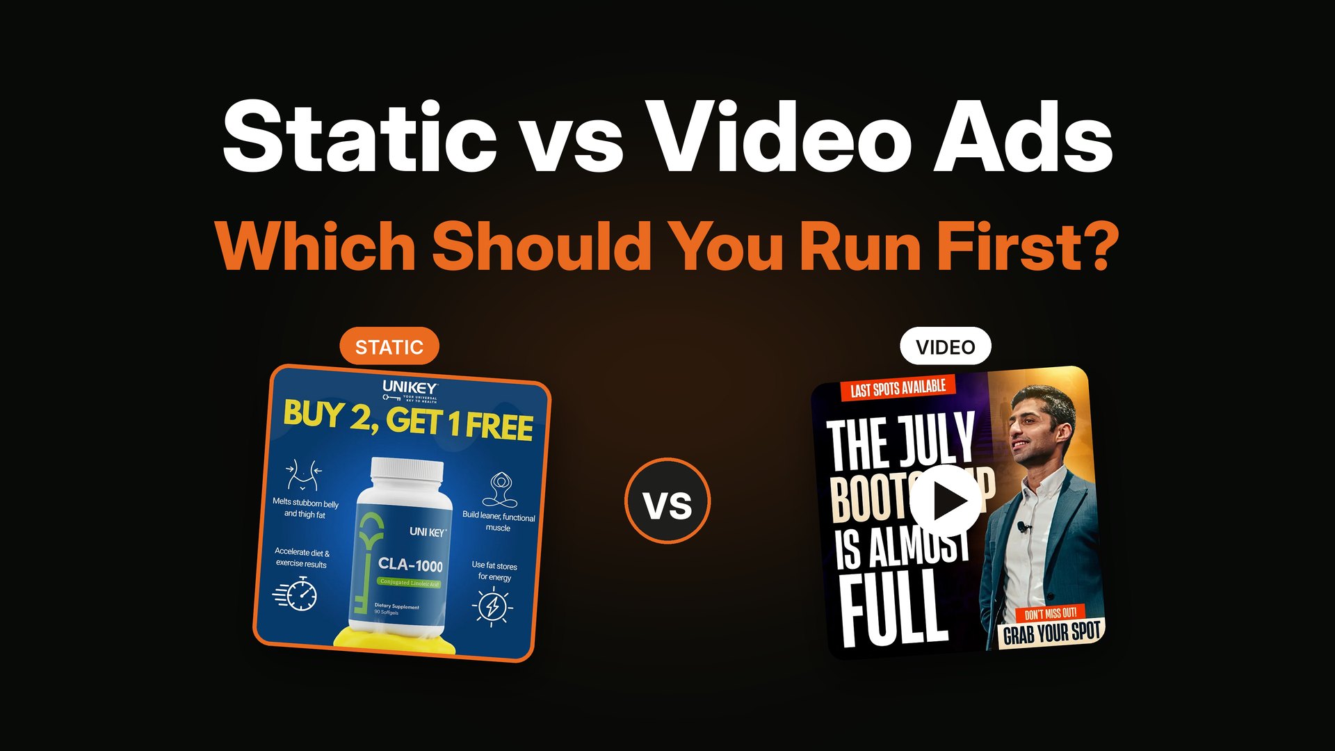
A quick word on "dynamic." A dynamic ad fills in product photos, names and prices for each person by itself. A static ad is the opposite. You design every detail, and every person sees the same thing. If you want a deeper look at the video side, read static vs video ads.
Where do static ads show up?
Static ads run almost everywhere people look at screens.
- Facebook and Instagram: in the feed, in Stories and in Reels. This is where I do most of my work.
- Pinterest: as pins that look like normal posts.
- LinkedIn and X: often for B2B offers and events.
- Google Display: the banners you see on websites and apps.
- Print and outdoor: posters, billboards and newspaper ads are also "static advertisements," because they never move.
In this post I focus on digital static ads for paid social, because that is where most brands spend their money.
The 8 types of static ads (with real examples)
Every static ad I make fits one of these eight types. Some ads mix two. Knowing the types helps you pick the right one for your goal.
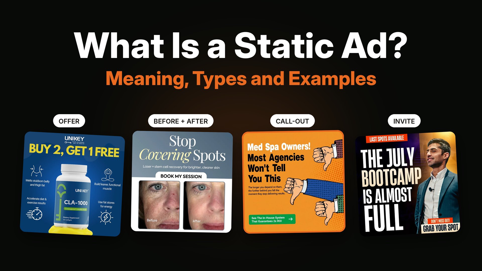
1. The offer ad
This ad leads with the deal. Think "Buy 2, get 1 free" or "20% off and free shipping." The offer is the biggest thing on the page, and the product sits right under it.
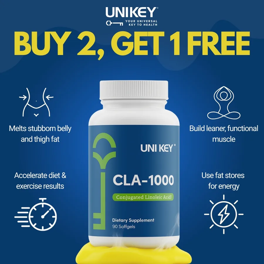
An offer static ad for a supplement brand. The deal is the headline.
Use it when: you have a real discount, a bundle or a free gift, and the buyer already knows your product.
2. The benefit ad
This ad leads with one result the buyer wants. It does not list ten features. It picks one promise and says it loud.
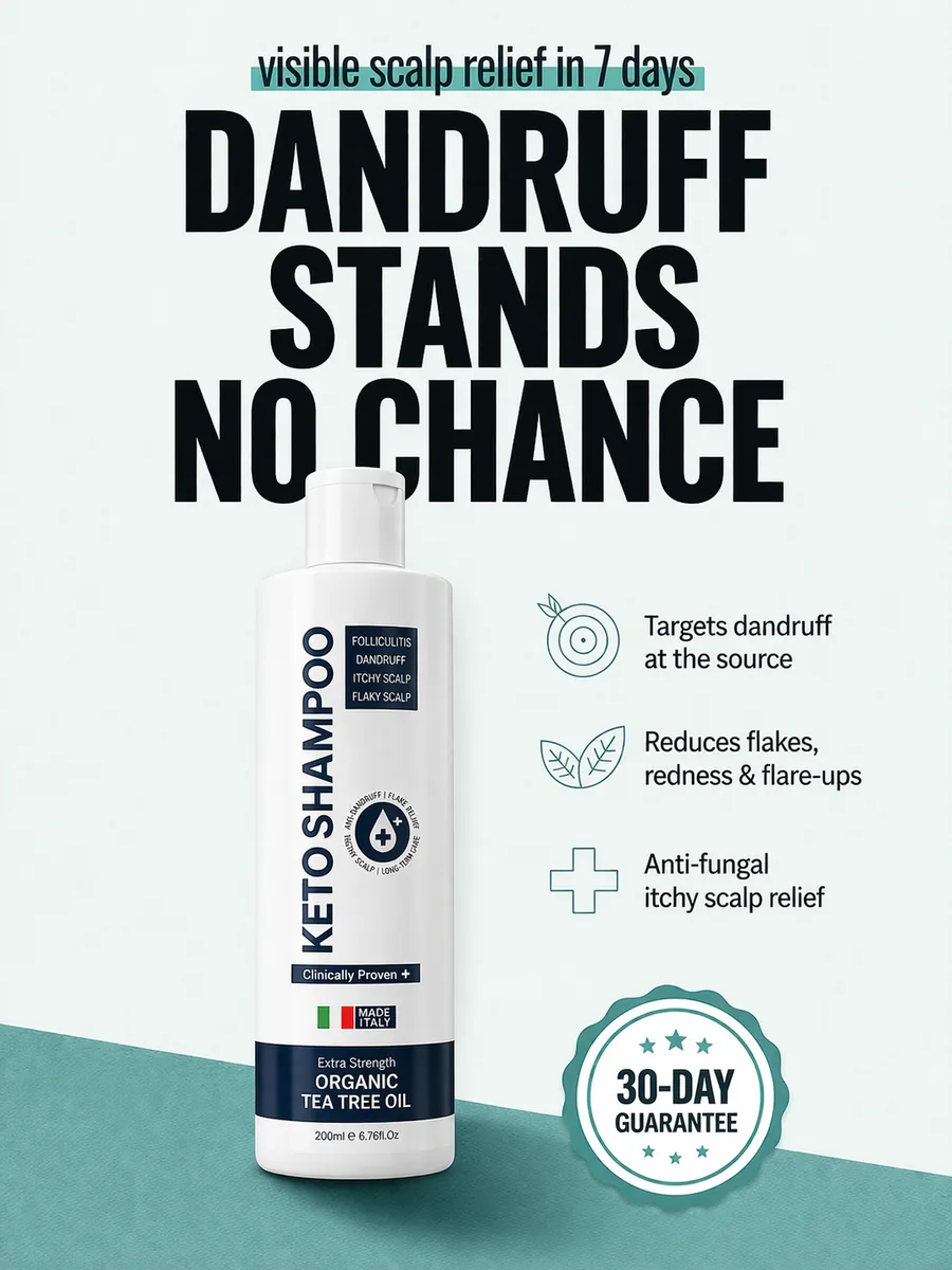
A benefit static ad. One promise, one product, one guarantee badge.
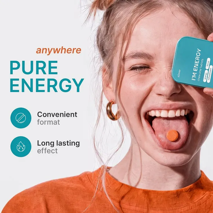
A benefit ad with two short points and one big promise: pure energy, anywhere.
Use it when: your product fixes a clear problem, like dandruff, back pain or messy books.
3. The comparison ad
This ad puts your product next to the usual choice and lets the buyer see the gap. It works well when people think "all of these are the same."
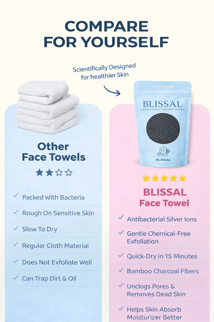
A comparison static ad with a simple checklist.
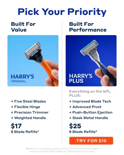
Another comparison ad. Two choices side by side, with the price and one button under each.
Use it when: you are in a crowded market and need to show why you are different.
4. The before and after ad
This ad shows a change. Skin before and after. A messy kitchen before and after. The picture tells the story without many words.
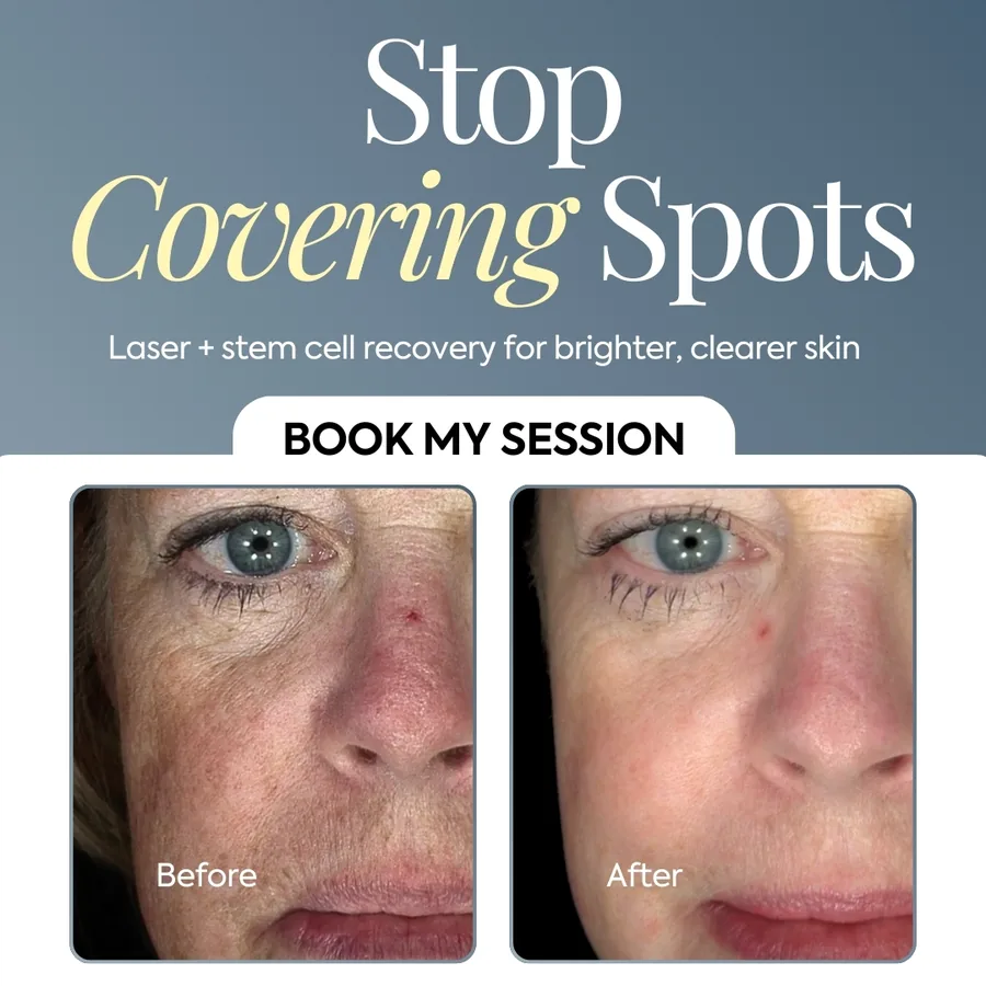
A before and after static ad for a skin clinic.
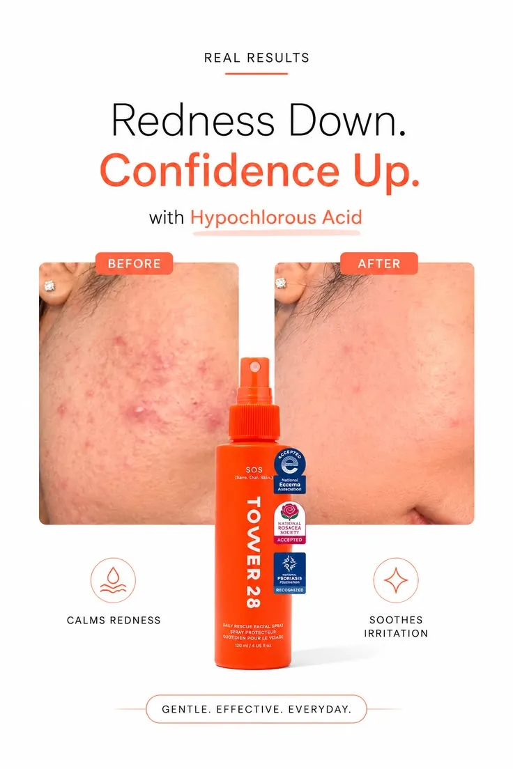
A before and after ad with trust badges. The picture shows the change and the badges build trust.
Use it when: your result is easy to see. Check the platform rules first, because some claims need care.
5. The proof ad
This ad leads with a number, a review or a result. People trust other people more than they trust brands, so proof is strong.
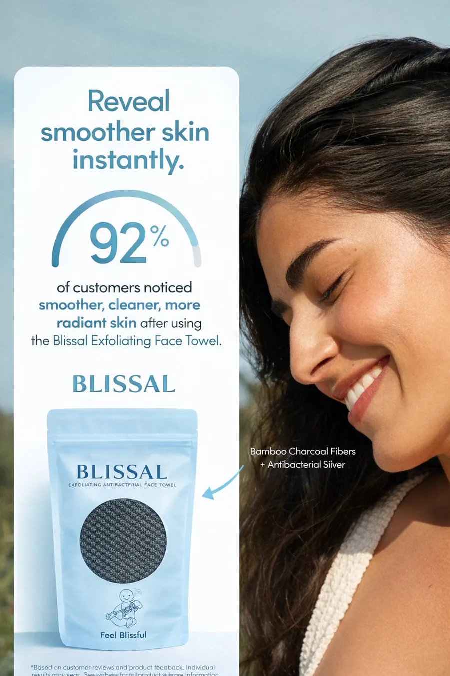
A proof static ad that puts a customer number in the middle.
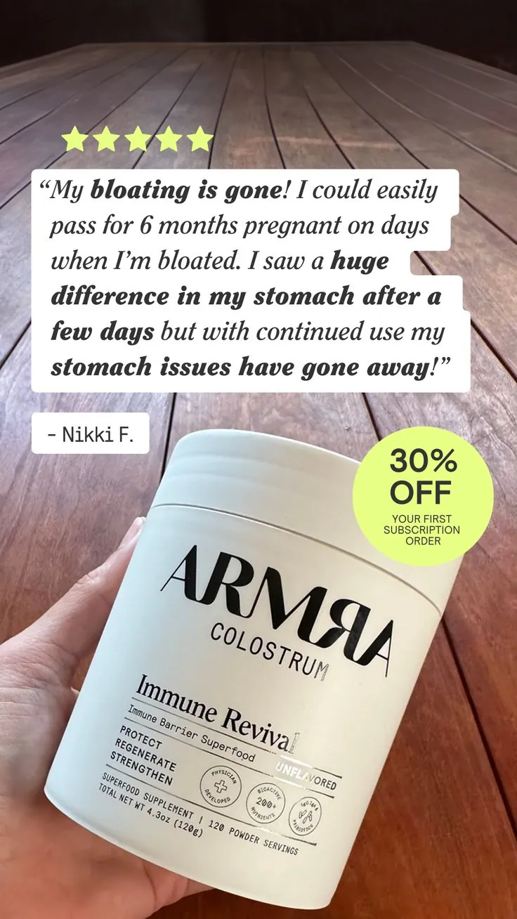
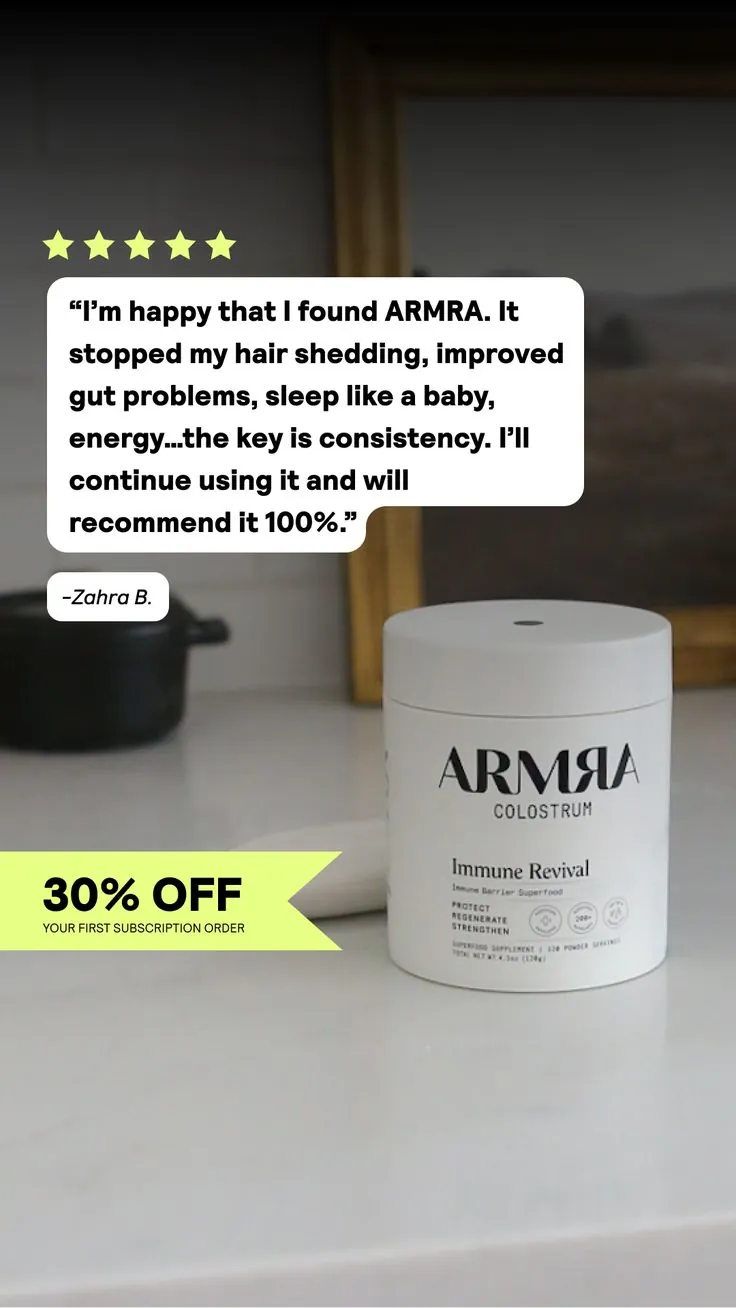
Review-style proof ads. A real customer quote, five stars and a small offer badge.
Use it when: you have real reviews, real numbers or press you can show.
6. The call-out ad
This ad names the buyer in the first line. "Med spa owners!" "Loan officers." "Barbers." The right person feels seen, and everyone else keeps scrolling. That is fine, because you only pay for people who matter.

A call-out static ad for B2B. The audience is the first line.
Use it when: you sell to one clear group, like a job or a niche.
7. The invite ad
This ad invites people to a webinar, a class, an event or a call. It shows the topic, the date and a face, plus one button.

An invite static ad for a live bootcamp. Scarcity is the headline.
Use it when: you want sign-ups, not sales. I wrote a whole guide on webinar ads for coaches.
8. The teach ad
This ad gives a small lesson right in the image. A list of "do this, not that." A short chart. A tip. The buyer learns something in two seconds and trusts you more.
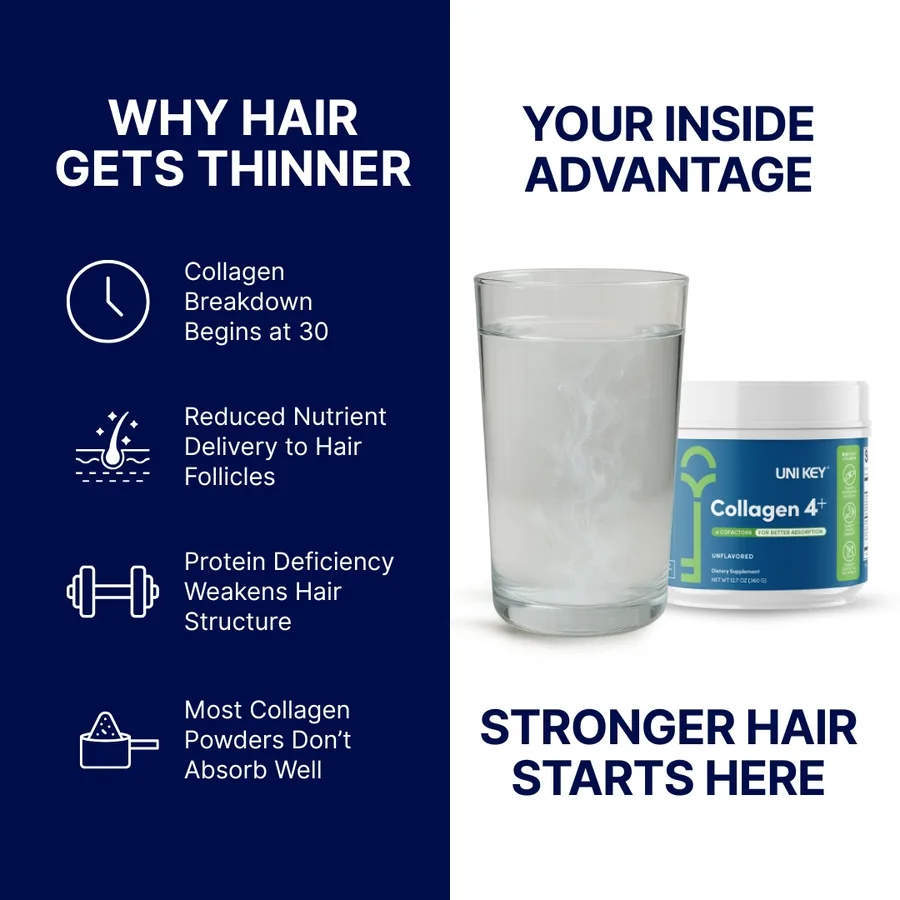
A teach static ad. It explains the problem before it sells the fix.
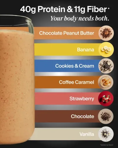
A teach ad in chart form. It shows seven flavors in one clear picture.
Use it when: your product needs a little explaining, or your buyer does not yet know they have a problem.
You can see all of these in my static ads portfolio, sorted by industry.
More static ad styles you will see
The eight types above are the base. Brands also mix them into a few styles that you will see all over your feed. Here are the ones I use most.
Phone-screen ads
These ads look like something on your phone: a text message, a note, a lock screen or a keyboard. They blend into the feed, so people read them before they notice it is an ad.
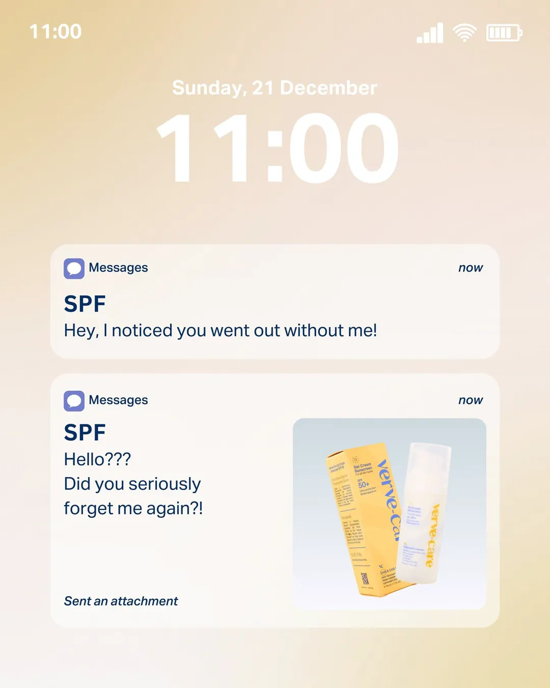
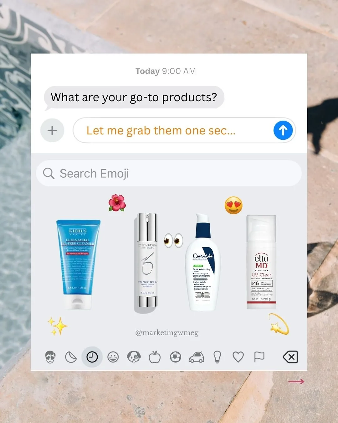
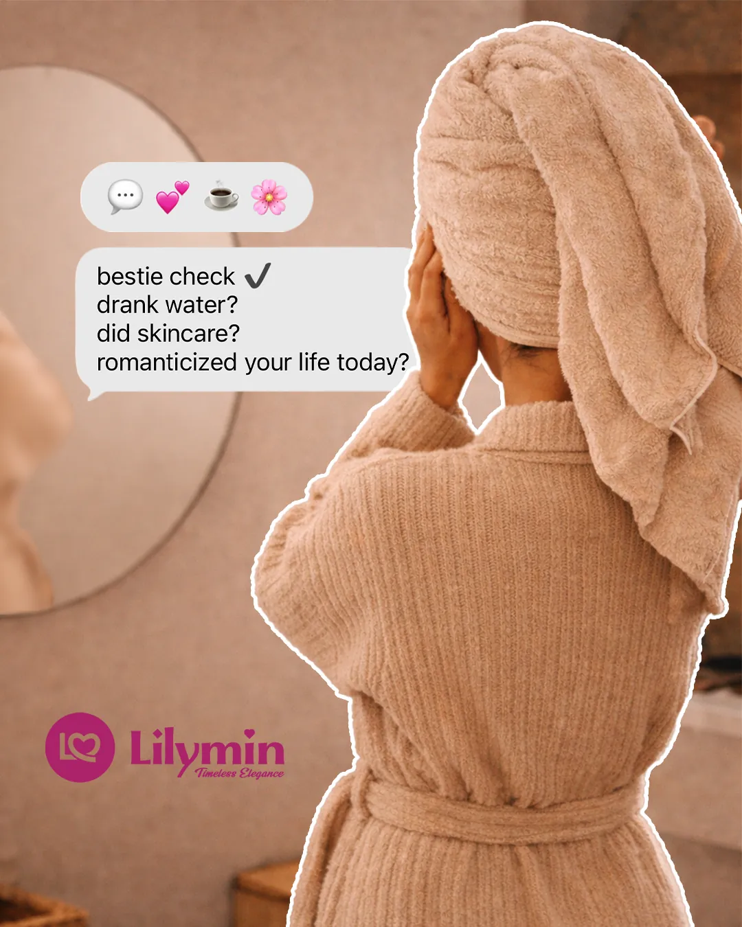
Phone-screen static ads. A lock screen text, an emoji keyboard and a chat bubble.
Use them when: your brand is friendly, young or fun, and you want a "message from a friend" feel.
Press and authority ads
These ads borrow trust from a magazine, a news site or a known name. A big quote or a news-style headline does the selling.

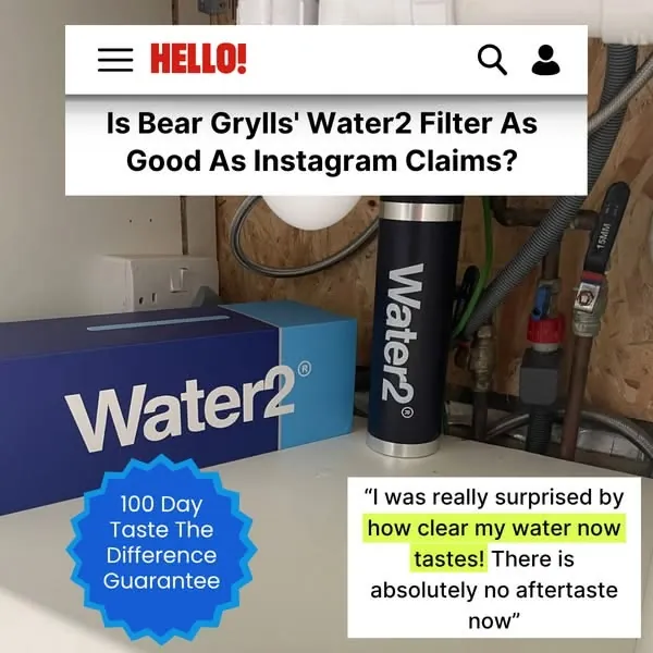
Press-style static ads. One shows a magazine quote, the other copies a news headline.
Use them when: you have real press, awards or reviews. Never invent a quote.
Teaser and scroll-stopper ads
These ads make you curious. They hide something, ask a question or show a strange picture, so you stop and look.
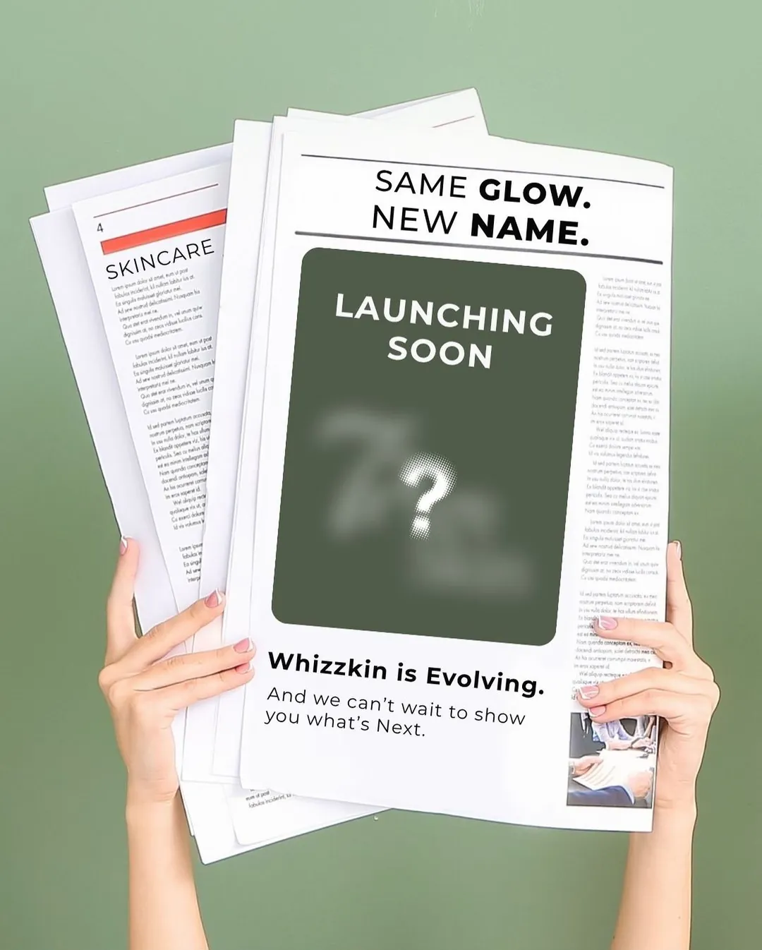
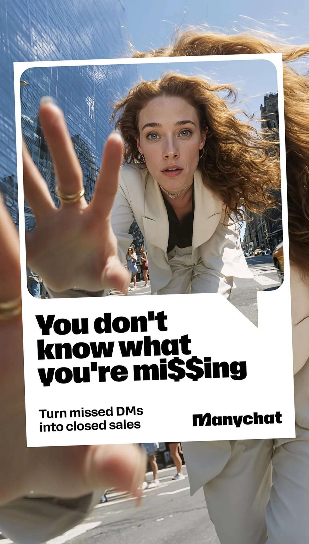
A teaser ad for a new name, and a scroll-stopper with a hand reaching out of the screen.
Use them when: you are launching something new or your feed is full of look-alike ads.
Question and story ads
These ads look like a question box or a story post. The brand answers a real question, so it feels helpful, not salesy.
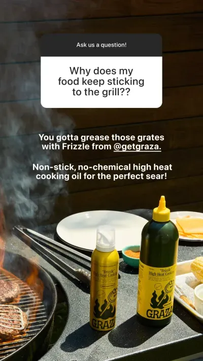
A story-style ad. A question from a customer, then a short answer with the product.
Use them when: your buyers ask the same questions again and again.
Event flyers
Not every static ad sells a product. Events, classes and community nights use the same ideas: a big headline, the date, the place and one clear next step.
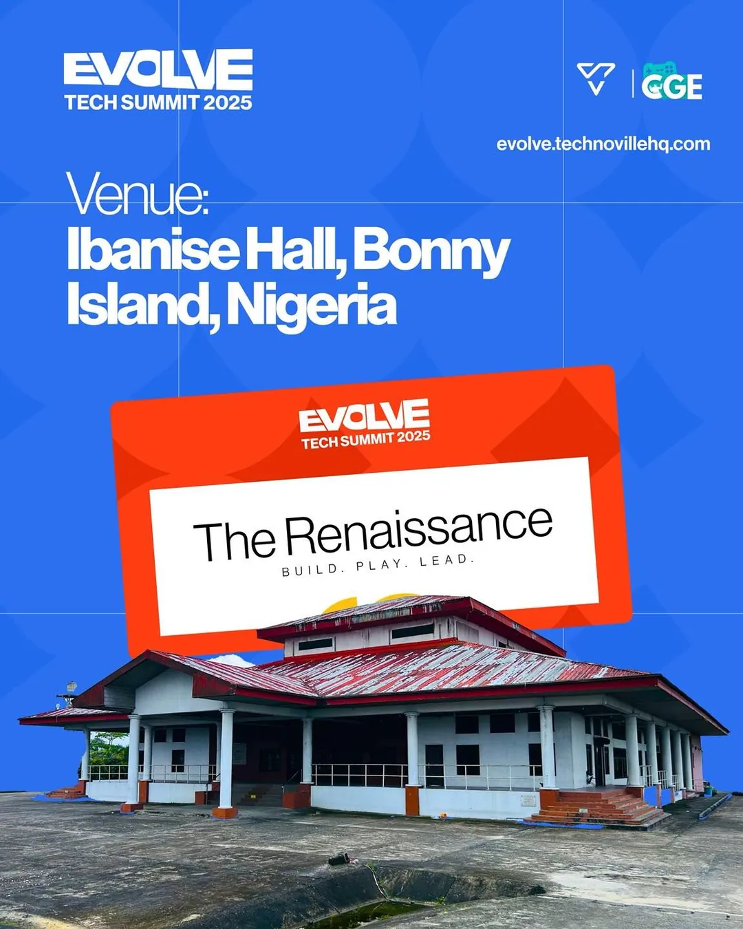

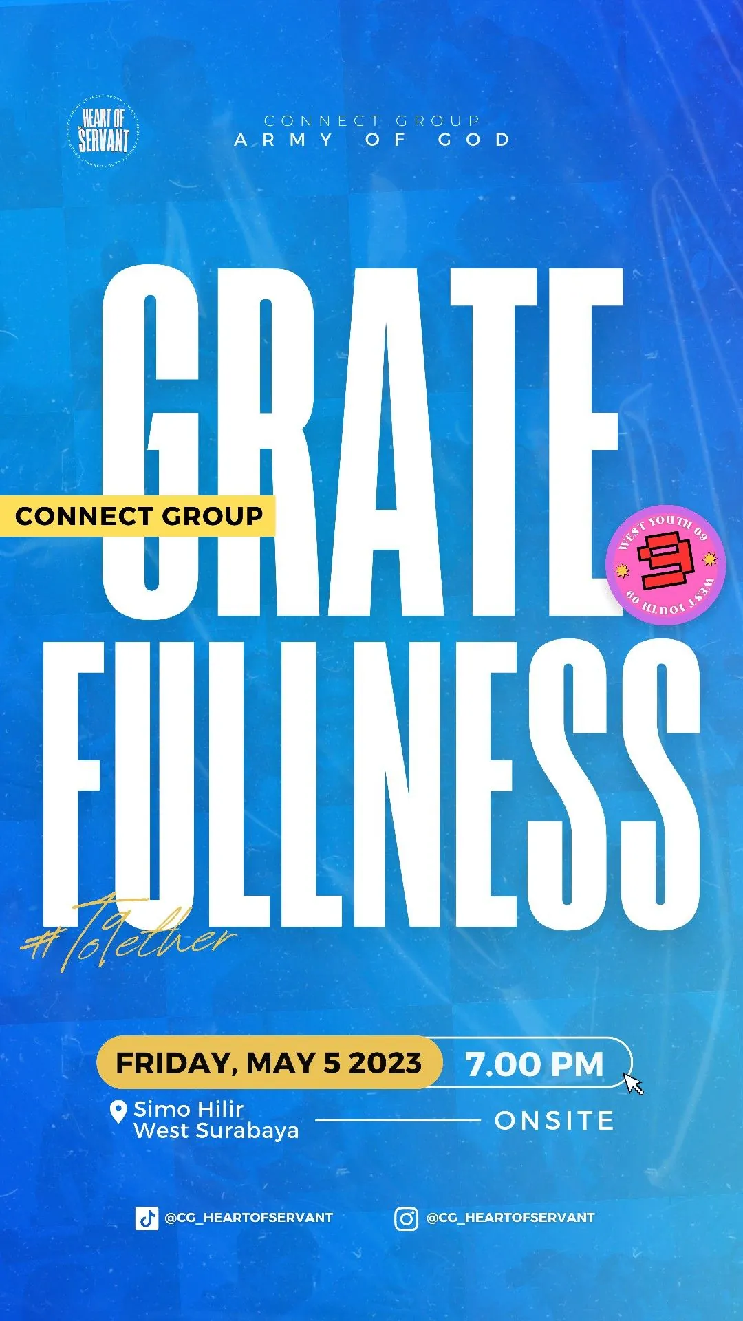
Event static ads. A venue announcement, a campus tour poster and a community night story.
Use them when: you want people to show up, sign up or save a date.
What size is a static ad?
Most static ads use one of three shapes.
| Shape | Size | Where it fits best |
|---|---|---|
| Square (1:1) | 1080 x 1080 pixels | Feed on most apps |
| Portrait (4:5) | 1080 x 1350 pixels | Facebook and Instagram feed, because it takes more space |
| Tall (9:16) | 1080 x 1920 pixels | Stories and Reels |
Sizes change, so check the platform before you export. Jon Loomer keeps a clear guide to recommended aspect ratios by placement for Meta ads, and Meta shares its own rules in the Meta ads guide. Leave some space at the top and bottom of tall ads. Apps put buttons and names there.
Pros and cons of static ads
What static ads do well
- They are fast. You can make one in a day, not a week.
- They are cheap to change. Fix a typo or test a new headline in minutes.
- They are easy to test. You can run five ideas side by side.
- They load fast, even on slow phones.
- They are clear. One idea, one picture, one button.
Where static ads are weaker
- They cannot show how a product works in motion.
- They have no sound, so they cannot tell a long story.
- They need a strong first look, because there is nothing else to hold the eye.
None of these are deal breakers. They just tell you when to add video. My rule is simple: start with static to find the message, then turn the winning message into video.
When should you use static ads?
Use static ads when:
- You are new to paid ads and want to start cheap.
- You need to test many angles fast.
- Your offer is easy to explain in one line.
- You sell a product people can understand from a picture.
- Your ads keep getting tired and you need fresh ones every week. I cover that in why Facebook ads stop working after a few days.
How to make your first static ad in four steps
- Pick one buyer. Not "everyone." One person with one problem.
- Write one promise. Say it in ten words or fewer.
- Pick one picture. A product, a face or a clear graphic.
- Add one button. "Shop now," "Get the guide," "Save my seat."
Then read my step-by-step guide to designing a static ad. If you want opening lines to start from, grab my free hook bank, and for ideas by angle see the static ad swipe file.
Words you will hear about static ads
- Creative: the ad itself, the image and the words.
- Hook: the first thing a person reads or sees.
- CTA: "call to action," the button or the line that asks for the click.
- Placement: where the ad shows, like Feed or Stories.
- CTR: click-through rate, the share of people who click.
- ROAS: return on ad spend, the money you make for each dollar you spend.
FAQ
What is a static ad?
A static ad is an ad made from one still image. It has no video and no motion. It usually has a headline, a picture, some proof or an offer, and a button.
What are static ads in digital marketing?
In digital marketing, static ads are image ads that run on places like Facebook, Instagram, Pinterest, LinkedIn and Google Display. They are the most common ad type because they are quick to make and easy to test.
What is a static advertisement?
A static advertisement is another name for a static ad. The word can also mean print ads, posters and billboards, because those do not move either.
What is the difference between static and dynamic ads?
A static ad is one fixed image that you design by hand. A dynamic ad is built by the platform from a product list, so the picture, name and price change for each person. Static gives you more control over the look. Dynamic saves time for stores with large catalogs.
Are static ads good?
Yes. Static ads are strong for testing messages, running offers and keeping costs low. Many brands run static and video together. I explain how to split the two in static vs video ads.
How many words should a static ad have?
As few as you can. A headline of about five to ten words and one short line under it is often enough.
Can I make static ads myself?
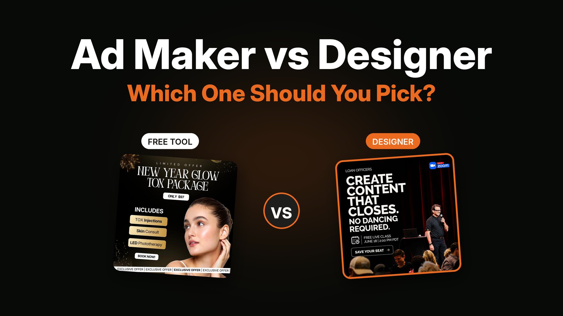
Yes, with a simple tool and a clear idea. I compare the options in static ad makers vs a designer. If you want a steady flow of new ads, hiring a static ad designer saves a lot of time.
Want static ads for your brand?
I design static ads and YouTube thumbnails for DTC, e-commerce, info-product and coaching brands, and I help with the strategy too, so you get ideas and not only layouts. See what is included on my services page. If it looks like a fit, book a short call and we can start with a small test batch.