TL;DR: To design a good static ad, pick one buyer, write one promise, add one picture, and finish with one button. Then make the text big, keep the colors few, and check the ad on your phone. The whole job takes eight steps. I will show each step with real ads from my own work.
Good ad design is not about being fancy. It is about being clear. A buyer scrolls fast. If your ad is hard to read, they are gone.
I design static ads every week, and I follow the same eight steps each time. In this guide I will walk through them in plain words, show real ads as examples, and share the simple rules I use for text, color and layout. You do not need to be a pro designer to use them.
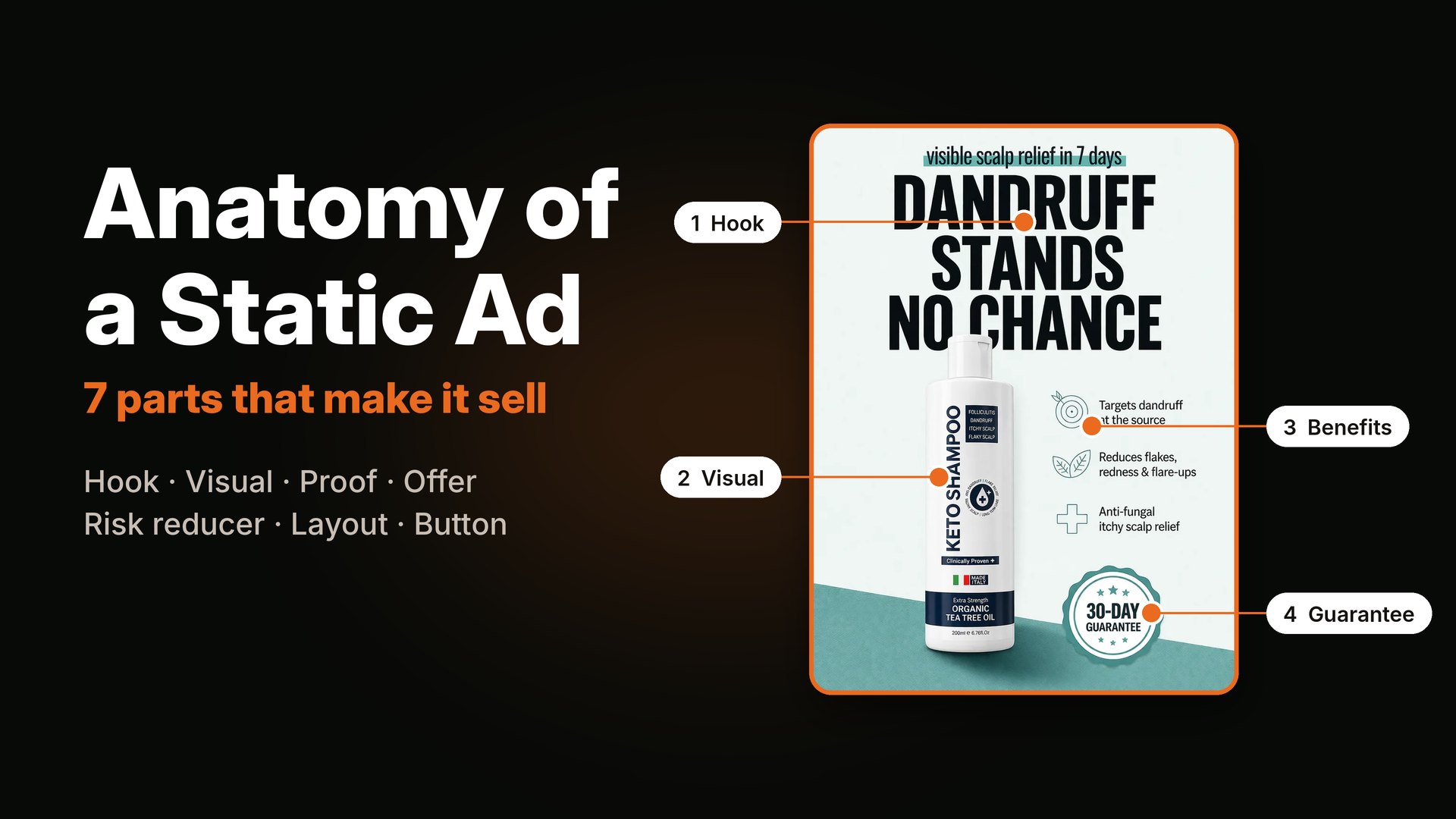
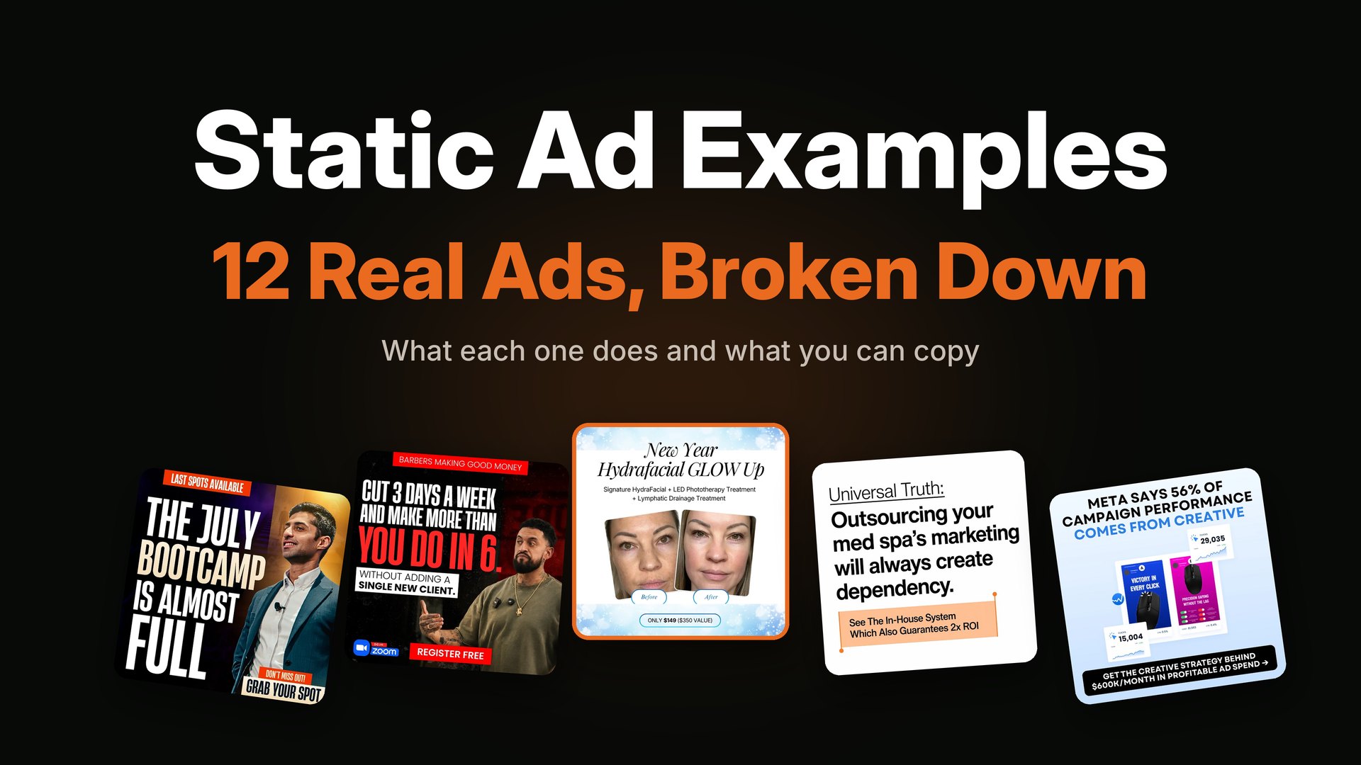
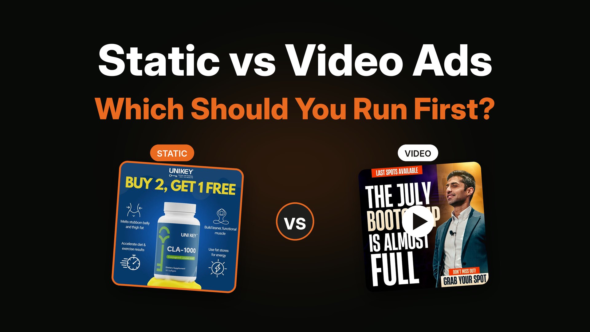
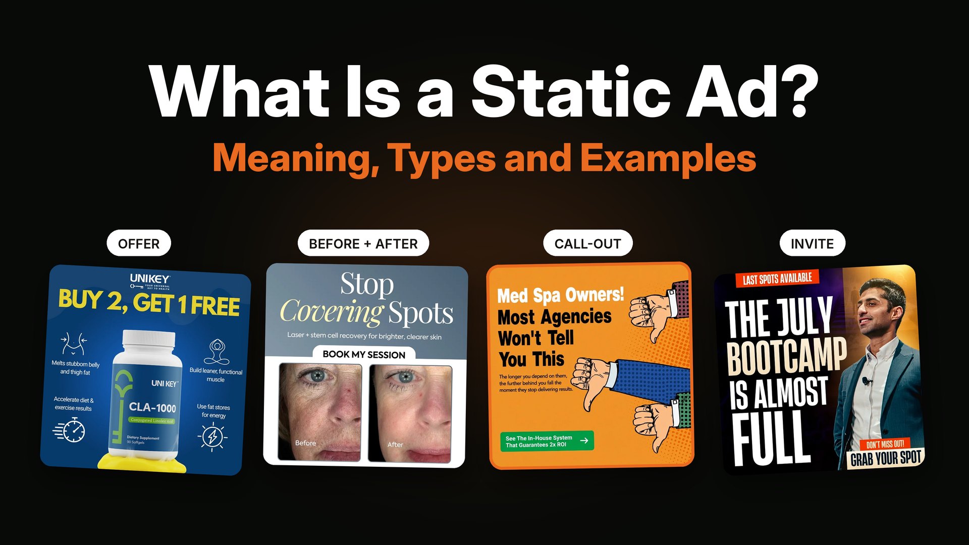
If you are new to the idea, start with what a static ad is. If you want to know what each part of an ad does, read the anatomy of a static ad.
Step 1: Pick one goal and one buyer
Before you open any design tool, answer two questions.
- What do I want the person to do? Buy, sign up, book a call, or watch.
- Who is the person? Be specific. "Busy moms who want easy dinners" is better than "women."
One ad, one goal, one buyer. When an ad tries to talk to everyone, it speaks to no one.
Step 2: Write the promise first
The headline is the real design. Write it before you pick a color or a font.
A good headline does one of three things:
- It names the buyer: "Barbers making good money."
- It names the pain: "Dandruff? No problem."
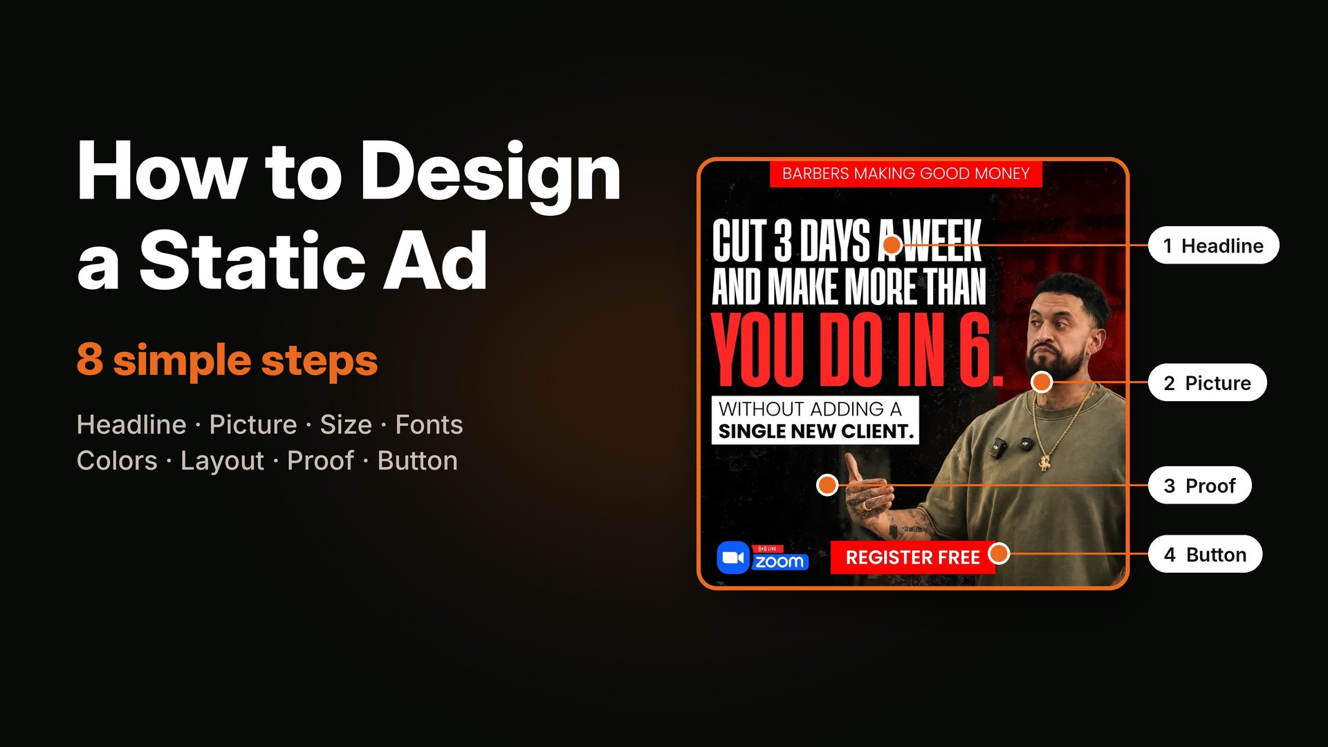
- It names the result: "Cut 3 days a week and make more than you do in 6."

Good ad design starts with the headline. This one names the result and the buyer.
Keep it short. Five to ten words is a good target. If you need opening lines, my free hook bank has plenty.
Step 3: Pick one picture
The picture is the thing the eye lands on first. Choose one.
- For a product, show the product big and clean.
- For a service or event, show a real face looking at the viewer.
- For an idea, use a simple graphic or a number.
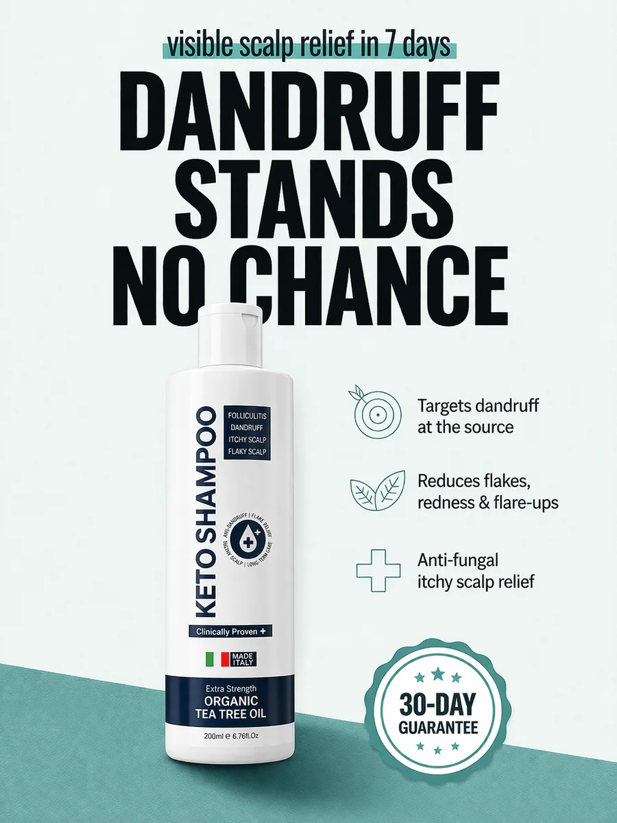
One product, big and clear. Nothing else fights for attention.
Do not use five small pictures when one big one will do. Busy ads feel cheap and are hard to read.
Step 4: Pick the right size
Make the ad in the size where it will run. Making a square ad and stretching it later makes the text look bad.
- 1080 x 1350 (4:5): best for Facebook and Instagram feed.
- 1080 x 1080 (1:1): works almost everywhere.
- 1080 x 1920 (9:16): for Stories and Reels.
For the latest rules by placement, see Jon Loomer's guide to recommended aspect ratios for Meta ads. If you plan to run tall ads, keep your text away from the very top and bottom, because apps cover those spots.

A tall 9:16 ad. The face and the headline sit in the middle, away from the top and bottom edges.
Step 5: Choose two fonts and three colors
This is where many people get lost. Keep it small.
Fonts
- Use one bold font for the headline.
- Use one plain font for small text.
- Do not use more than two.
Colors
- One main color from the brand.
- One bright color for the part you want people to notice.
- One neutral, like white, black or cream.
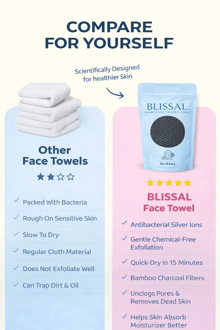
Few colors and a clean layout make a comparison easy to read.
A simple trick: use the bright color on only one thing, like the main number or the button. If everything is bright, nothing is.
Step 6: Build the layout
Layout is how you place things so the eye moves in the right order. Most people read an ad like this: top, then middle, then bottom, with a quick look at the biggest thing first.
Use three sizes of text:
- Big for the headline.
- Medium for the support line.
- Small for details like dates or fine print.
Then follow these rules.
- Contrast: dark text on light, or light on dark. Never gray on gray.
- Space: leave room around the text. White space is not wasted space.
- Alignment: line things up. Left edges should match.
- Size: if you cannot read it on your phone at arm's length, make it bigger.

Three sizes of text, one face, one button. The eye knows where to go.
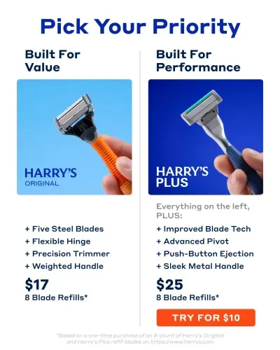
Two columns, clear headings and a button under each. Easy to scan in two seconds.
Step 7: Add proof and one button
Now add the two things that turn a nice picture into an ad.
Proof answers "Why should I believe you?" Use one of these:
- A real number, like "92% of customers noticed smoother skin."
- A short review.
- A guarantee, like "30-day guarantee."
- A logo from a place that featured you.
The button answers "What do I do now?" Use a short, clear action: "Shop now," "Save my seat," "Get the free guide."
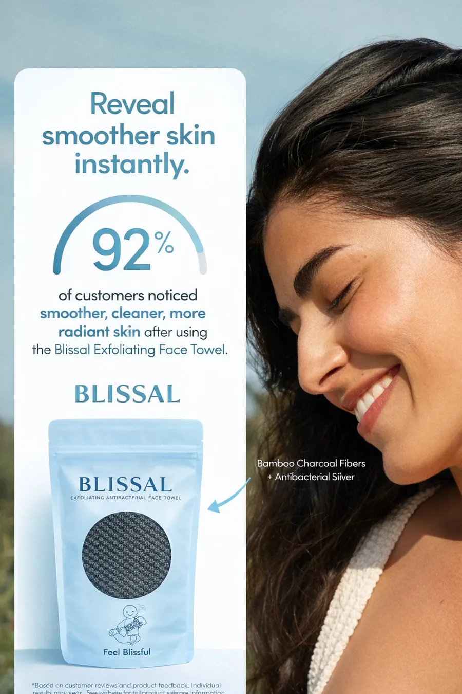
One strong number is proof enough. Do not add five.
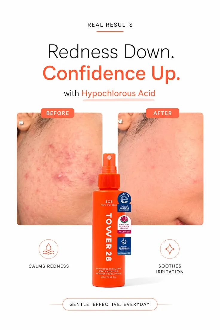
Before and after photos plus trust badges. The proof is easy to see.
Step 8: Check it on your phone
This step takes a minute, and it saves many bad ads.
- The two-second test. Look at the ad for two seconds, then look away. Can you say what it offers? If not, simplify.
- The squint test. Squint your eyes. Do you still see the headline and the main picture? If they blur together, increase contrast.
- The thumb test. Hold your phone at arm's length. Is the text easy to read? If not, make it bigger.
- The typo test. Read every word out loud. A typo in an ad can cost trust fast.
Bonus: make it look like the phone
Some of the best ads do not look like ads at all. They look like a text, a note or a notification. This works because people trust what looks familiar.
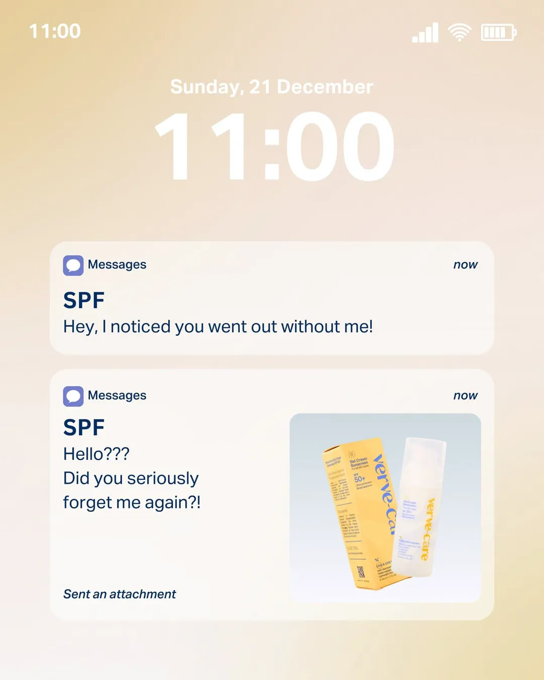
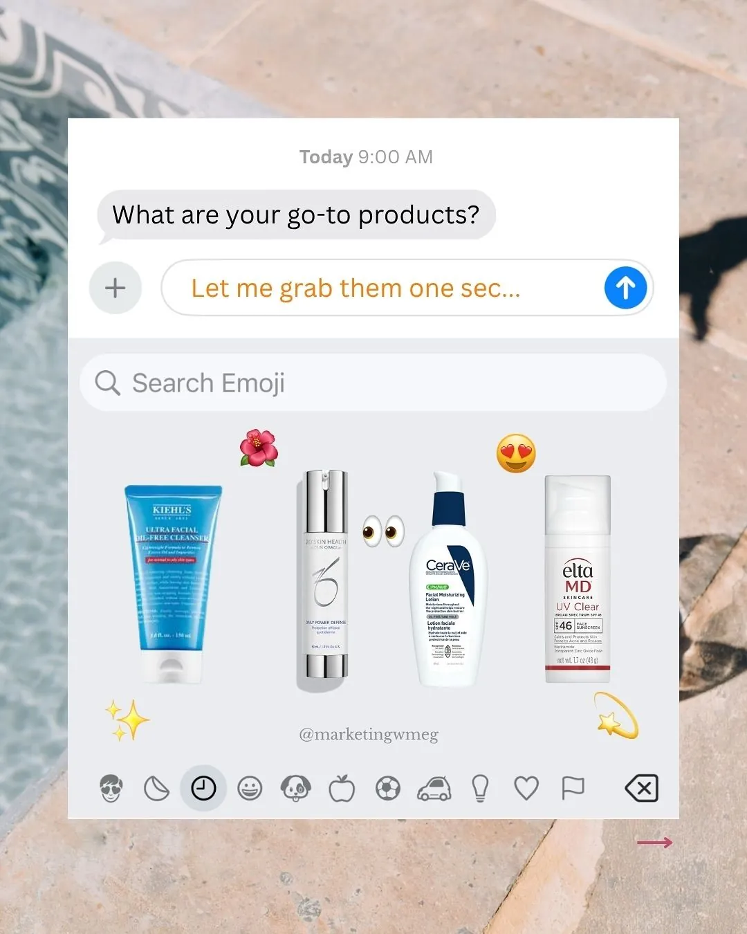
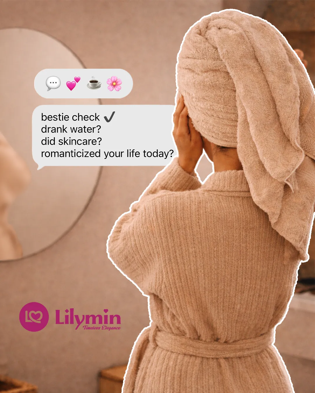
Phone-screen ad ideas: a lock screen text, an emoji keyboard and a chat bubble.
If you try this, keep the same rules: one idea, big text, one button.
Make three versions, not one
Never launch one ad and hope. Make three versions that change one big thing, like the headline or the picture. Then test them side by side. I explain how much to test in how many ad creatives to test per week.
Common ad design mistakes
- Too many words. Long text belongs on the landing page.
- Too many ideas. One ad, one message.
- Weak contrast. Pretty but unreadable.
- A tiny button. If people cannot find it, they cannot click it.
- Stock-photo look. Real faces and real products feel more honest.
- No proof. Big promises with nothing behind them feel risky.
If your ads get clicks but no sales, the problem may be outside the image. I cover that in high CTR but no sales on Meta ads.
Free tools you can use
You can make a decent ad in a simple tool like Canva or Figma. Both have free plans. Pick the one you find easier. I compare the choices, including AI tools, in static ad makers vs a designer.
Quick checklist before you launch
- One buyer and one goal
- A headline of ten words or fewer
- One clear picture
- Two fonts at most
- Three colors at most
- One piece of proof
- One button
- Right size for the placement
- Checked on a phone
- Read out loud for typos
FAQ
How do I design an ad?
Pick one goal and one buyer, write the headline first, add one clear picture, choose two fonts and three colors, add proof and a button, and then check the ad on your phone. The eight steps above walk through each part.
What makes a good ad design?
A good ad design is clear. The buyer can understand who it is for and what they get in about two seconds. It has one main message, strong contrast, big text and one button.
What size should a static ad be?
Most feed ads work well at 1080 x 1350 pixels (4:5) or 1080 x 1080 pixels (1:1). Stories and Reels use 1080 x 1920 pixels (9:16). Check the platform before you export.
How many fonts and colors should I use?
Two fonts and three colors are enough. One bold font for the headline, one plain font for the small text, and one bright color for the thing you want people to notice.
Can I design ads for free?
Yes. Tools like Canva and Figma have free plans. The tool matters less than the idea. A clear message in a simple layout beats a fancy design with a fuzzy message.
Do I need a graphic designer for ads?
Not always. If you only need one or two ads, a simple tool is fine. If you need new ads every week and want help with the ideas as well as the looks, read how to hire a static ad designer.
Want ads designed for you?
I design static ads for coaches, e-commerce stores, clinics and B2B brands, and I plan the angles with you. You can look through the ad examples or visit my services page. If you like the style, book a short call and we can start with a small batch.